ALDI - Like Brands. Only Cheaper - Vampire - Ad Analysis

AI Editor notes
Straight from the gut!!
“This is textbook challenger brand work. It's smart, fast, and funny. Why a vampire? Because who needs sun protection more? It's the perfect visual shortcut. The real punchline isn't even the ball hitting his head; it's the price reveal. There's no fat on this idea. It knows exactly what it's doing: planting a seed of doubt that you're overpaying elsewhere. Solid.”
Quick Summary
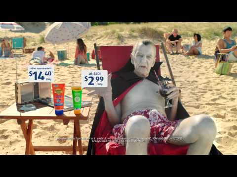
This ad uses a simple, instantly recognizable comedic scenario—a vampire at the beach—to deliver a brutally effective price comparison. It perfectly distills ALDI's entire business model into 15 seconds: we sell products that are just like the famous brands, but we sell them for a lot less. The humor is just the sugar coating for a hard-hitting retail message.
Executive Summary
ALDI's 'Vampire' is a prime example of a challenger brand using wit and simplicity to land a powerful retail message. At its core, the ad operates on a simple human truth: people like getting a good deal, and they feel smart when they find a product that's just as good as the expensive version for a fraction of the price. The entire 'Like Brands. Only Cheaper' platform is built on this insight, and this execution is one of its most efficient and memorable.
The creative strategy follows a clean Setup-Turn-Payoff structure, perfectly suited for a short-form ad. The setup is the visual gag: a vampire, the one creature who should never be in the sun, is relaxing on a packed Australian beach. This absurd image immediately functions as a hook, creating curiosity. The 'Turn' occurs as the vampire delivers his deadpan lines, comparing the two sunscreens. The on-screen price comparison ($14.40 vs. $2.99) is the real meat of the ad. The vampire's line, 'But I do not love the living,' adds a small comedic beat before the final payoff. The payoff is twofold: a physical gag (a beach ball hitting him in the head) provides a laugh, but the real commercial payoff is the tagline, 'Like brands. Only cheaper.' This final line reframes the entire joke not just as entertainment, but as evidence for ALDI's core value proposition.
The debrief for the team that made this would be a lesson in economy. In just 15 seconds, the ad establishes a character, presents a problem (high sunscreen cost), offers a solution (ALDI's Ombra brand), and lands a memorable brand message. It doesn't waste a single frame. It proves that a hard-selling retail ad doesn't have to be boring or obnoxious; it can be funny, distinctive, and strategically sharp. The key learning is that when your value proposition is as strong as ALDI's, you don't need to overcomplicate the creative. You just need a clever, simple vehicle to deliver the facts.
Theme Keywords
Brand Position
The smart choice for quality groceries without the brand-name price tag.
Brand Archetype
Jester
Creative Game Plan
Use a universally understood character in an unexpected situation to make a simple price comparison memorable and funny.
Diagnosis: Issues & Solutions
Primary Issue: Strategic Sense
The Problem:
The ad's greatest strength—its single-minded focus on price—could also be perceived as a long-term risk. By consistently hammering the 'cheaper' message, the brand risks being seen only as the 'cheap' option, potentially alienating customers for whom quality perception is tied to price.
The Solution:
Future iterations of the campaign should ensure the 'Like Brands' part of the equation receives equal creative emphasis. For example, show the product performing flawlessly under stress or receiving an unexpected endorsement to reinforce the quality message alongside the price.
Secondary Issue: Emotional Connection
The Problem:
The ad's humor is fleeting and situational. It creates a chuckle, not a lasting feeling or brand affinity. This is a deliberate trade-off for efficiency, but it means the ad does little to build a deeper brand story beyond 'value'.
The Solution:
This isn't a major flaw given the format, but a longer-form version of the campaign could explore more character-driven stories that allow for a slightly warmer or more empathetic connection, adding another dimension to the brand's personality beyond just being witty.
Additional Notes
Related Links
Credits
Share this Analysis
More ALDI ad breakdowns
- ALDI - 60sec "Now this is Christmas" - BMFALDI
- ALDI Australia - TVC 15 Christmas Lights - Nothing Beats the Perfect Aussie ChristmasALDI
- ALDI Good Different Always On Retail - "Mandarins" - 15sALDI
- ALDI "Like Brands. Only Cheaper" - GreekALDI
- ALDI Like Brands. Only Cheaper. CockroachesALDI
- ALDI Like Brands. Only Cheaper. Pasta SauceALDI
- ALDI - Surfin' SantasALDI
- ALDI LunchboxALDI