A-LEAGUE COMMERCIAL - Ad Analysis

AI Editor notes
Straight from the gut!!
“It's a bold, art-house take on a sports ad from an era dominated by rock anthems. The floating fans are a striking, if slightly bizarre, visual metaphor. It feels more like a Nike global spot than an ad for a domestic league, which is both its strength and its weakness. It's memorable and different, but I wonder if it was too abstract for the average Aussie sports fan it needed to win over.”
Quick Summary
This ad powerfully visualizes the core truth of sports fandom: for 90 minutes, the emotional experience of the crowd is as real, intense, and integral to the event as the physical action on the pitch. It sells the symbiotic relationship between fan and player.
Executive Summary
In 2007, the Australian A-League was still fighting for its place in a sports landscape dominated by entrenched codes like Aussie Rules and Rugby League. The challenge wasn't just to get people to watch soccer, but to feel that it was their sport. This commercial from Lowe Hunt, Sydney, sidestepped the typical sports ad playbook of star players and historical rivalries, opting instead for a far more ambitious and artful approach.
The Core Insight: The simple human truth at the heart of this ad is that for a true fan, watching a game is not a passive experience. The 90 minutes of a match are a visceral, emotional rollercoaster where the boundary between spectator and participant dissolves. The energy, hope, and despair of the crowd are as much a part of the event's fabric as the actions of the players themselves.
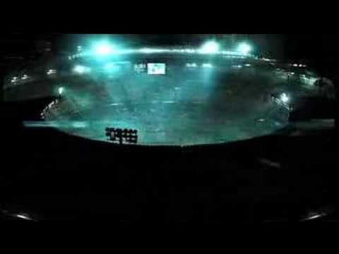
The Execution: The ad uses a Setup-Turn-Payoff structure built around its central creative metaphor. It sets up a world that is both familiar and epic: a grand stadium at night, the slick, slow-motion ballet of athletes, and the intense, focused faces of fans. The choice of UNKLE's 'Reign' is critical, lending the scene a moody, cinematic gravity far removed from standard sports hype tracks. The turn is the introduction of the surreal visual hook: fans are literally lifted from their seats by the emotional current of the game. They float, suspended in the stadium's atmosphere, their bodies reacting in concert with the play on the field—a fan mimics a header, a group sways with a dribble. This is where the ad commits to its high-concept idea, turning an internal feeling into an external, visual reality. The payoff is the escalation of this connection. A red card brings anguish to the floating fans; a sudden downpour soaks players and spectators alike, merging their experiences completely. The ad climaxes in a flurry of action, culminating in the simple, powerful tagline that summarizes the entire thesis: "90 MINUTES 90 EMOTIONS." The brand reveal is the final, confident statement, positioning the A-League as the purveyor of this profound experience.
The Debrief: The key lesson from this work is the power of a strong, singular creative idea. By choosing to dramatize one insight—the fan's emotional journey—in a visually unforgettable way, the ad achieved a level of distinctiveness that a conventional montage of game highlights never could. It proved that a challenger brand can carve out its own space not by shouting louder, but by speaking a different, more poetic language. It made the strategic decision to sell the feeling, not the facts, of the A-League.
Theme Keywords
Brand Position
The A-League is the home of Australia's most intense, cinematic, and emotionally profound sporting experience.
Brand Archetype
The Magician (transforming a stadium into a place of surreal, shared experience) with elements of The Everyman (focusing on the fan).
Creative Game Plan
Dramatize the intense, symbiotic emotional connection between fans and players by visualizing the crowd's feelings as a physical force that makes them float with the game.
Diagnosis: Issues & Solutions
Primary Issue: Clarity of "What's Next?"
The Problem:
The single biggest missed opportunity is the complete lack of a call to action. After creating a powerful mood and building excitement, the ad gives the viewer nowhere to go. There is no URL, no season start date, and no broadcast information, leaving potential new fans with interest but no path to engagement.
The Solution:
Add a simple, clean end card with the league's website (e.g., a-league.com.au) and the season start date. This minimal addition would have bridged the gap between creating brand desire and enabling consumer action.
Secondary Issue: Strategic Sense
The Problem:
For a league still in its infancy in 2007, the ad may have been too esoteric for the uninitiated. [2, 3] It doesn't feature any recognizable star players or highlight specific teams, which are often key entry points for casual sports fans. The abstract nature risks alienating the very audience it needed to grow.
The Solution:
Incorporate subtle identifiers, such as showing the names on the back of jerseys more clearly or using the final moments for a rapid montage of all club logos before the main A-League branding. This would have grounded the abstract concept with tangible team identities.
Additional Notes
Related Links
Credits
Share this Analysis
More Hyundai A-League ad breakdowns
- You've Gotta Have a Team: Yoshi visits Perth GloryHyundai A-League
- Hyundai A-League - What is Beautiful? - FFAHyundai A-League
- MLB ImitationMajor League Baseball (MLB)
- This is the Canadian Premier League. We Are Many, We Are One.Canadian Premier League
- Derek Jeter "Legacy" 2014 MLB CommercialMajor League Baseball (MLB)
- The Rugby League of the ExtraordinaryStobart Super League