TITLE: [Main Word]
PROJECT NAME: [Brand Name]
ARCHITECTURAL STRUCTURE: [Architectural Structure]
TYPE MECHANISM: [Type Mechanism]
SUBJECT: [Subject]
ACCENT COLOR: [Accent Color]
SUPPORTING TEXT: [Supporting Text]
FORMAT: 9:16 vertical poster
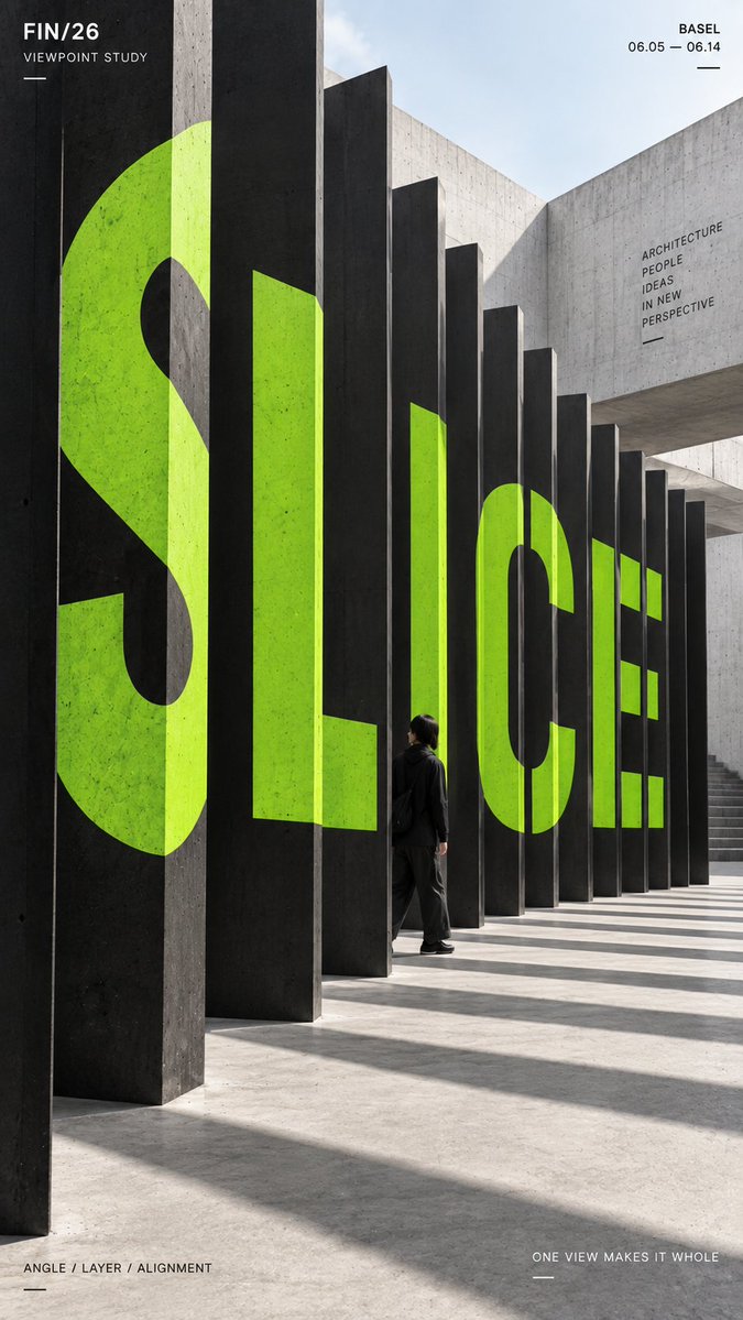
Create a high-impact perspective typography poster where oversized type is physically integrated into architecture and only becomes visually complete from one intentional camera viewpoint.
Build the architectural structure first, then let the typography strictly follow its real depth, surfaces, angles, gaps, folds and occlusion.
Depending on the selected mechanism, the word can be sliced across multiple vertical planes, span a physical gap between structures, break across staggered platforms, or continue over folded architectural surfaces.
The main word should occupy roughly 35–55% of the composition. Individual fragments may look abstract or incomplete on separate surfaces, but from the intended viewpoint they should visually align into one clear, readable word.
Use bold geometric sans-serif typography with one strong solid accent color against restrained architectural materials such as concrete, black, white or neutral stone.
If a person is included, keep them small and use them mainly as a scale reference. Let architecture naturally hide or overlap part of the figure so they feel physically inside the typographic space.
Add only a small amount of editorial information such as project name, location, date and one short thematic line.
Overall style: perspective typography, spatial graphic design, contemporary architecture, editorial poster, anamorphic installation, strong depth and clean hierarchy.
Avoid floating text, random distortion, weak alignment, decorative 3D extrusion, neon sci-fi effects, excessive filler copy, cluttered backgrounds, watermarks and numbering.
![[product packaging] prompt preview](https://prompts.pixloop.ai/cdn-cgi/image/width=600,format=auto,quality=80/prompts/assets/prompts/2064892529997414815/0.webp)
![[Word]: {MASS / VOID / FLOW / SKIN / 4–6 letter word} prompt preview](https://prompts.pixloop.ai/cdn-cgi/image/width=600,format=auto,quality=80/prompts/assets/prompts/2089995645973389582/0.jpg)

![An architectural blueprint of [BUILDING_NAME] placed on a {SURFACE}, with a photorealistic mini…](https://prompts.pixloop.ai/cdn-cgi/image/width=600,format=auto,quality=80/prompts/assets/prompts/2027644159285465175/0.jpg)