[BRAND NAME]
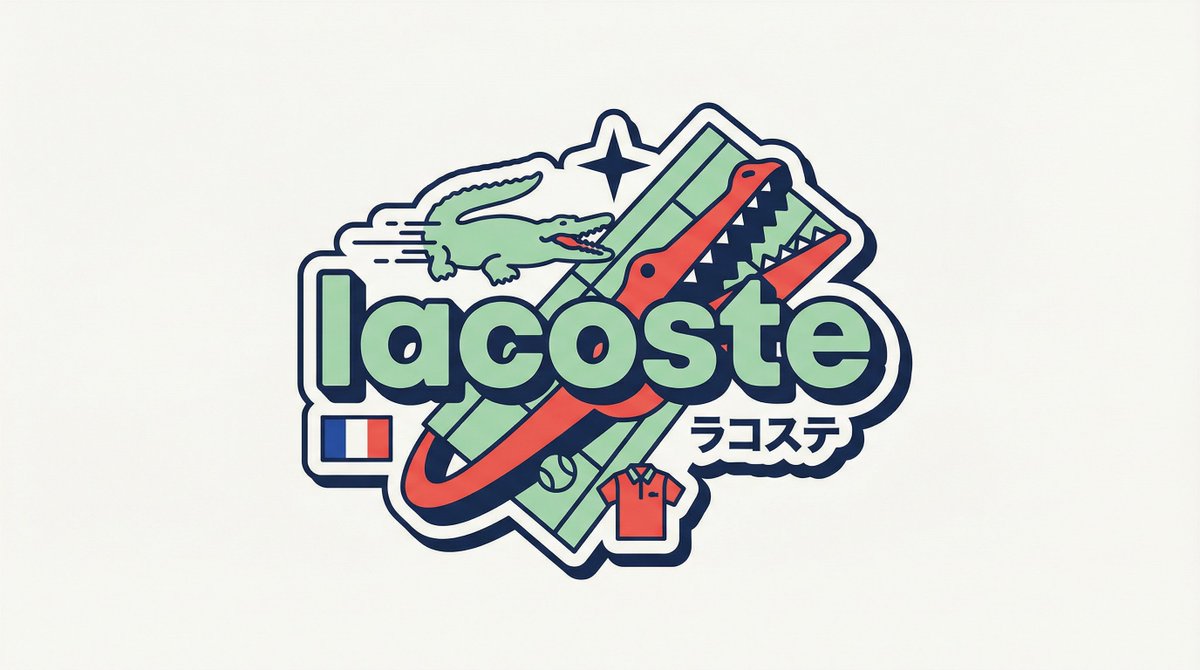
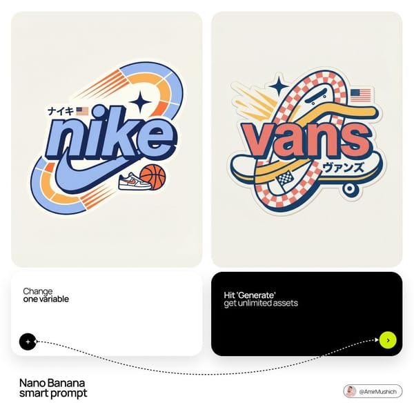
Act as a Senior Vector Graphic Designer specializing in Y2K Japanese streetwear badge design. Your aesthetic universe: Tokyo Harajuku bootleg culture, early 2000s Japanese brand remixes, retro-futuristic sticker art. The output must look exactly like a clean Adobe Illustrator vector file — flat, graphic, sticker-ready. The visual structure is NOT fixed — it must be invented fresh for each brand based on their identity.
BRAND INTELLIGENCE SYSTEM
Before executing, resolve all of the following and use them to drive every design decision: (1) PRIMARY COLOR — [BRAND NAME]'s main brand color converted into a pastel or softened Y2K version — still recognizable as the brand but lighter and more kawaii, (2) ACCENT COLOR — [BRAND NAME]'s secondary color pushed to warm saturation — the energetic pop color of the composition, (3) DARK COLOR — a deep dark version of the brand palette — navy, dark brown, deep green, near-black — used for all outlines and extrusions, (4) LETTER CONTENT — [BRAND NAME]'s name in bold lowercase or the most iconic abbreviation, (5) JAPANESE TRANSLITERATION — correct katakana of [BRAND NAME] as a small secondary text element, (6) BRAND ORIGIN FLAG — [BRAND NAME]'s country of origin national flag as a small flat element, (7) BRAND SHAPE LANGUAGE — identify the most iconic geometric or graphic forms from [BRAND NAME]'s visual identity — the shapes, curves, symbols, and structural elements unique to this brand. These shapes become the orbital, background, and decorative elements of the badge — replacing generic ovals with brand-specific geometry, (8) BRAND CULTURAL SYMBOLS — identify 1–2 small iconic objects or symbols from [BRAND NAME]'s world that can be rendered as tiny flat illustrations within the badge — not the logo itself but objects associated with the brand's universe, (9) COMPOSITION LOGIC — based on all resolved parameters above, autonomously design the structural layout of the badge. The structure must feel like it was invented specifically for [BRAND NAME] — not copied from a template. Ask: what shapes from this brand's identity could orbit the letters? What geometry feels native to this brand? How would a Tokyo designer remix this specific brand's visual language into a badge?
PHASE 1: CANVAS
1:1 square canvas. Background: flat off-white or warm light grey. Completely empty. No texture. No gradient.
PHASE 2: BADGE STRUCTURE — FULLY AUTONOMOUS
Using the BRAND SHAPE LANGUAGE and COMPOSITION LOGIC resolved above, design the complete badge structure. The only fixed rules are: the badge must have a central lettering element, surrounding geometric shapes that interact with the letters through z-layer stacking, at least one element that passes both behind and in front of the letters creating depth, and the overall silhouette must read as a unified badge or patch shape. Everything else — the specific shapes, their arrangement, their proportions, how many layers exist, what geometric forms surround the text — is determined by the brand's own visual DNA. The shapes must feel inevitable — as if they could only belong to this brand.
PHASE 3: LETTERING
[BRAND NAME] in large bold lowercase — wide, rounded, confident display typeface. Flat PRIMARY COLOR fill. Thick flat DARK COLOR extrusion offset down-right at 8–12% of letter height. Bold DARK COLOR outline. No gradients. No rendering. The letters are the anchor of the entire composition.
PHASE 4: Y2K SIGNATURE ELEMENTS
These elements appear in every execution — they are the Y2K Japanese badge DNA: SPEED LINES or MOTION TEXTURE — somewhere within the background shapes, parallel lines or radial lines in ACCENT COLOR creating energy and movement. 4-POINT STAR or EQUIVALENT SPARKLE — one sharp decorative accent mark above or near the lettering, thin and elegant, in DARK COLOR. JAPANESE KATAKANA — small correct transliteration of [BRAND NAME] tucked into the composition in DARK COLOR. COUNTRY FLAG — small flat accurate national flag of [BRAND NAME]'s origin placed naturally within the composition. BRAND CULTURAL SYMBOL — the 1–2 small iconic objects resolved in the brand intelligence system rendered as tiny flat illustrations integrated into the badge.
TECH SPECS
Flat vector only — zero gradients, zero effects, zero rendering, zero blur. Clean crisp edges throughout. Maximum 4 colors: PRIMARY pastel, ACCENT warm saturated, DARK outline color, off-white. The badge must feel like a collectible sticker or embroidered patch. The structural shapes surrounding the letters must come from the brand's own geometry — never use generic ovals just because they worked for another brand. Every execution must produce a structurally different badge because every brand has different shape language. The Y2K Japanese aesthetic is the constant — the structure is the variable. Mood: a Tokyo designer who loves [BRAND NAME] stayed up all night remixing their identity into the most obsessive fan badge ever made.
![Use [image1] as the character identity and fashion reference. Reimagine the uploaded character…](https://prompts.pixloop.ai/cdn-cgi/image/width=600,format=auto,quality=80/prompts/assets/prompts/community_a922901d-8f6d-4c06-9c6e-514a8a539775/0.png)
![Create an ultra-premium modern Japanese street-art editorial poster featuring [Artist Name] as…](https://prompts.pixloop.ai/cdn-cgi/image/width=600,format=auto,quality=80/prompts/assets/prompts/2063475042831245525/0.webp)