Woodie's Heroes 2021 - Ad Analysis

AI Editor notes
Straight from the gut!!
“This is solid, heart-warming work. It's a well-trodden path for CSR ads—pull the heartstrings, show the brand as a force for good. But the 'light that's always on' metaphor, anchored by the owl night light, is a smart and ownable device for a home-focused retailer. It feels genuine and does its job without being overly sentimental.”
Quick Summary
Woodie's effectively uses a simple, emotional metaphor—a child's ever-present night light—to represent its ongoing commitment to children's charities. This approach successfully builds brand warmth and community goodwill, reinforcing its position as a caring, national brand without needing to sell a single product.
Executive Summary
This Woodie's ad is a textbook example of how to execute a corporate social responsibility campaign with grace and strategic intelligence. It understands that the goal isn't just to raise money, but to weave the brand into the fabric of the national community. The core insight is simple yet potent: the public feels a deep-seated desire to protect the innocence of childhood, and they will feel warmly toward brands that share and act on that value.
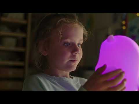
The execution follows a classic Setup-Turn-Payoff structure. The Setup (0:00-0:14) is a beautifully crafted montage of a young girl and her owl-shaped night light. The scenes are intimate, warm, and relatable, establishing a baseline of idealized childhood comfort and security. The night light is her constant companion, a silent guardian. This section wordlessly establishes the central metaphor.
The Turn (0:15-0:28) arrives with the gentle but firm voiceover: 'Childhood isn't the same for every child.' This line immediately reframes the preceding idyllic scenes, suggesting that this comfort is not universal. The ad then introduces 'Woodie's Heroes' as the response to this problem. The brilliance here is how the campaign is positioned not just as a fundraiser, but as a collective of 'heroes'—the charities themselves—who are metaphorically described as 'a light that's always on.' This language directly connects the function of the charities to the function of the night light shown moments before.
The Payoff (0:29-0:41) makes this connection explicit. As the voiceover speaks of a light that's 'day and night,' we see the night light glowing in the sleeping children's room, and then its light radiates out of the house window into the dark street. This is the visual culmination of the entire concept. The light of comfort is no longer contained to one home; it's a beacon of hope for the entire community, powered by the charities Woodie's supports. The final slate showing the logos of the charities and the clear call-to-action to donate provides the necessary information without breaking the gentle, hopeful tone.
The debrief for the team that created this is that metaphorical storytelling, when grounded in a simple, universal truth, is incredibly effective for brand-building. The ad doesn't need to show hardship to communicate need; it does so by contrasting an ideal with the spoken reality. It successfully positions Woodie's not as a mere retailer, but as a facilitator of community care, a far more valuable and enduring brand position.
Theme Keywords
Brand Position
Woodie's is the caring, dependable Irish retailer that helps you build a better home and a stronger community.
Brand Archetype
The Caregiver
Creative Game Plan
Equate the constant, quiet reassurance of a child's night light with the unwavering support Woodie's and its partner charities provide to vulnerable children across Ireland. [8]
Diagnosis: Issues & Solutions
Primary Issue: Emotional Connection
The Problem:
The ad effectively establishes an emotional baseline with the idealized childhood, but the 'problem' it aims to solve remains entirely abstract. By only showing happy, healthy children, there is a slight disconnect between the peaceful visuals and the voiceover's claim of need.
The Solution:
In a future iteration, consider incorporating a single, brief, and tastefully shot visual that hints at the work of one of the charities—for example, a child's hand gently holding an assistance dog's harness. This would ground the abstract need in a tangible reality, increasing the emotional urgency without resorting to overly dramatic imagery.
Secondary Issue: Strategic Sense
The Problem:
The strategic link between a DIY/home store and children's charities relies entirely on the 'light' metaphor. While effective, it could be made more robust.
The Solution:
A single line in the voiceover could strengthen the connection. Something like, 'At Woodie's, we believe every child deserves a safe and happy home. But for some, that security comes from a different kind of hero.' This would explicitly tie Woodie's core business of 'home' to the campaign's mission.
Additional Notes
Related Links
Credits
Share this Analysis
More Woodie's ad breakdowns
- The Neighbors' Promo CodeLeroy Merlin
- Leroy Merlin - There's still love somewhereLeroy Merlin
- Petfriendly prices, by McCann Buenos Aires to Sodimac HomecenterSodimac Homecenter
- Happy Valentine’s Day with BETC and French home improvement store Leroy MerlinLeroy Merlin
- Easy San Martin 75 segs ENG SBTEasy
- Comercial Promart Homecenter - The Perfect DaughterPromart Homecenter
- Homepro: Tricky DadHomePro
- JULA THE GUITAR 30s SWEJula