Toyota Riga Cycling Marathon. United in rhythm! #tribeWork - Ad Analysis

AI Editor notes
Straight from the gut!!
“This is trying very hard to be cool, and for the most part, it works. The DJ/cyclist metaphor is a solid creative hook. It’s slick, stylish, and has a good beat. But let's be honest, it does more for the event's image than it does for Toyota. You could swap the Toyota logo for any other brand and it would make no difference. It feels like a great ad for the Riga Velomarathon that Toyota just happened to pay for.”
Quick Summary
This ad successfully elevates a local cycling marathon from a simple sporting competition into a cool, cultural event. By drawing a smart parallel between the rhythm of a cyclist's preparation and a DJ's craft, it frames the race as an expression of urban artistry, making it more appealing to a younger, style-conscious audience.
Executive Summary
This ad for the Toyota Riga Cycling Marathon is a study in metaphorical storytelling, successfully reframing a community sporting event as a piece of urban culture. It sidesteps the expected clichés of smiling families on bikes and grueling shots of athletes. Instead, it builds a world of mood, rhythm, and precision, aiming for 'cool' over 'cute.' The core strategy is to broaden the event's appeal by associating it with the artistry and flow of a DJ, a cultural touchpoint that resonates with a younger, urban demographic.
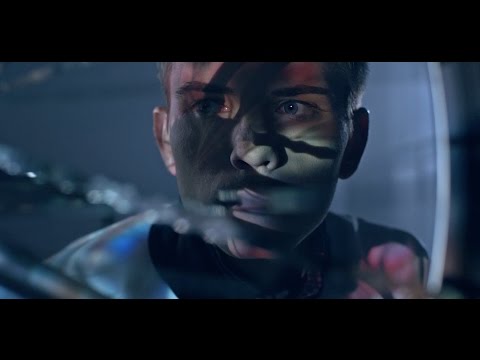
The creative execution follows a classic Setup-Turn-Payoff structure. The Setup introduces two parallel, seemingly disconnected worlds: a cyclist meticulously preparing his machine in a moody workshop and a DJ cueing up a set in a dark club. The cinematic, blue-toned visuals and deliberate pacing create an atmosphere of serious focus. The Turn is the ad's central conceit, where the editing and sound design begin to interweave these two worlds. The spin of a bike wheel is matched with the spin of a record; the click of a gear shift syncs with a beat from the mixer. This creates a unified rhythm, revealing the shared essence of both disciplines: precision, dedication, and the search for a perfect flow state. The Payoff arrives with the title card, 'TOYOTA RĪGAS VELOMARATONS,' which resolves the metaphor. The event is presented as the culmination of this rhythm, the place where individual passions unite. The tagline mentioned in the description, 'United in rhythm,' perfectly encapsulates this idea.
The debrief for the creative team would be positive. They took a potentially dry brief—promote a sponsored marathon—and infused it with style and a clever concept. The decision to use metaphor instead of literal depiction makes the event feel more significant and culturally relevant. While the connection to the title sponsor, Toyota, is superficial at best (it's purely a logo slap at the end), the ad does its primary job exceptionally well: it makes you want to know more about the event. It proves that even a local event promotion can have high conceptual and executional standards.
Theme Keywords
Brand Position
Toyota positions itself as an integral part of the city's cultural fabric, enabling and celebrating community passions.
Brand Archetype
The Citizen
Creative Game Plan
Equate the precision and rhythm of cycling with the artistry of a DJ to reframe a marathon as a cool, cultural event.
Diagnosis: Issues & Solutions
Primary Issue: Brand Connection
The Problem:
The biggest pitfall is the complete lack of a meaningful link to Toyota. The ad is so effective at building a brand for the *event* that the sponsor feels like an afterthought. A competitor could have sponsored this ad with no changes.
The Solution:
Integrate the sponsor more authentically. Even a subtle element, like the mechanic using a Toyota-branded tool or a visual cue that connects the car's engineering to the bike's precision, could have forged a stronger, more memorable link.
Secondary Issue: Emotional Connection
The Problem:
The ad is stylish and cool, but also cold. It captures the 'flow state' of preparation but misses the communal joy and human energy that is the ultimate payoff of participating in a marathon.
The Solution:
In the final sequence, briefly intercut the stylized preparation shots with authentic, vibrant footage from a previous year's event—show the smiling faces and the crowd energy to connect the 'cool' preparation with a warm, human outcome.
Additional Notes
Credits
Share this Analysis
More Toyota ad breakdowns
- Hum Hai Fuel-Efficient. #HumHaiHybridToyota
- Hum Hai Green. #HumHaiHybridToyota
- Take the HY road with the all-new Toyota Urban Cruiser HyryderToyota
- Hum Hai Affordable. #HumHaiHybridToyota
- Over 10 years of Hybrid Leadership in India | #ToyotaIndiaToyota
- Hum Hai Hybrid. Hum Hai Young. #HumHaiAwesomeToyota
- GRIP Anime Series S1 | Teaser | ToyotaToyota
- Toyota | Find Your Drive | Case FilmToyota