Toyota "Glass Organs" TVC - AdNews - Ad Analysis

AI Editor notes
Straight from the gut!!
“This is smart, grown-up advertising. It treats the audience with respect. Instead of another shot of a car skidding to a halt to avoid a child's ball, they give us a beautiful, slightly haunting art film. It makes a competitor's ad about 'dynamic handling' seem trivial by comparison. This is a brand playing the long game, building trust, not just chasing a monthly sales target.”
Quick Summary
This ad succeeds by transforming a complex piece of safety software, Toyota's THUMS technology, into a powerful and intuitive visual metaphor: human fragility represented by glass organs. It bypasses technical jargon to create a purely emotional argument for the brand's commitment to safety, making an invisible feature feel tangible and deeply important.
Executive Summary
Toyota’s “Glass Organs” is a quiet triumph of advertising, a piece that confidently trades the loud clichés of the automotive category for the hushed reverence of an art gallery. It was created for Toyota Australia by Saatchi & Saatchi Sydney and launched in March 2011 to communicate a foundational, yet invisible, brand attribute: a deep commitment to safety engineering. [3, 6] The ad avoids the typical tropes of screeching tires and near-misses, instead opting for a sophisticated visual metaphor that is both beautiful and unsettling.
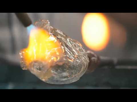
The core insight is simple and profound: humans are fragile. In the violent physics of a car crash, our bodies are vulnerable systems. The ad doesn't need to show the crash; it communicates the stakes by stating, “In a collision, you might as well be made of glass.” This single line provides the entire foundation for the creative execution. The masterstroke is making this metaphor literal. We watch as artisans, with the focus and precision of surgeons, blow and shape glass into anatomically perfect organs. The process is beautiful, demonstrating craftsmanship and care—qualities Toyota wants to associate with its own engineering.
The execution follows a simple setup-reveal-payoff structure. The setup is the mesmerizing process of glassblowing, which draws the viewer in with its beauty and mystery. The reveal occurs when we see that the objects being made are not vases, but a heart, lungs, and a nervous system. This is the turn—the moment the ad’s true purpose becomes clear and the feeling shifts from aesthetic appreciation to a poignant sense of vulnerability. The payoff is the assembly of the full glass figure and the voiceover explaining Toyota’s THUMS (Total Human Model for Safety) technology. [1, 2] This technology, which allows for advanced digital crash simulation on virtual human bodies, is the “reason to believe.” By showing the glass figure being placed in a Toyota, the ad visually transfers the care and craftsmanship we just witnessed from the artisans to the car itself. The final line, “That's what makes it a Toyota,” lands not as a boast, but as a summary of a deeply held philosophy.
The debrief for any team watching this is a lesson in the power of metaphor. Toyota took a complex, data-driven safety feature and made it emotional. They didn't sell the software; they sold the reason for the software. They understood that people don’t buy safety features, they buy the feeling of being safe. By refusing to show a crash, the ad keeps the focus on the preciousness of what is being protected, not the violence of the threat. It’s a confident, mature piece of communication that builds brand equity far more effectively than any demonstration of anti-lock brakes ever could.
Theme Keywords
Brand Position
The brand that combines human-centric empathy with relentless engineering to provide unparalleled safety and peace of mind.
Brand Archetype
The Caregiver, with elements of the Sage.
Creative Game Plan
Visually demonstrate the profound implications of human fragility to make an invisible safety technology feel indispensable.
Diagnosis: Issues & Solutions
Primary Issue: Emotional Connection
The Problem:
The ad's sophisticated, almost sterile, beauty could be perceived as emotionally distant by some viewers. The focus is so heavily on the cerebral metaphor that it risks being admired more than it is felt, lacking a raw, human moment to connect with.
The Solution:
Introduce a brief, fleeting shot of a real person—a child's face, a parent's hands—reflected in the glass of the car window as the door closes. This would ground the abstract concept of 'fragility' in a tangible, relatable human connection without undermining the elegance of the core idea.
Secondary Issue: Strategic Sense
The Problem:
The ad does such a good job of looking like a piece of high-art content that it might fail to register as an ad for Toyota for some less-attentive viewers until the final seconds. The branding is subtle for most of its runtime.
The Solution:
Subtly integrate the Toyota brand earlier. For instance, the grid wall in the background of the workshop could have faintly resembled the three ovals of the Toyota logo, or a blueprint on the table could have had a Toyota watermark, planting the brand seed without disrupting the narrative.
Additional Notes
Related Links
Credits
Share this Analysis
More Toyota ad breakdowns
- Hum Hai Fuel-Efficient. #HumHaiHybridToyota
- Hum Hai Green. #HumHaiHybridToyota
- Take the HY road with the all-new Toyota Urban Cruiser HyryderToyota
- Hum Hai Affordable. #HumHaiHybridToyota
- Over 10 years of Hybrid Leadership in India | #ToyotaIndiaToyota
- Hum Hai Hybrid. Hum Hai Young. #HumHaiAwesomeToyota
- GRIP Anime Series S1 | Teaser | ToyotaToyota
- Toyota | Find Your Drive | Case FilmToyota