The ONE Sobha App - Ad Analysis

AI Editor notes
Straight from the gut!!
“Visually, this is beautiful. It’s a full-on Wes Anderson homage, which is a bold choice. But I'm left wondering if it's trying too hard to be clever. They spend 50 seconds building this abstract world of 'craft' and only 10 seconds explaining what the app actually *is*. It sells the feeling effectively, but for a new product launch, it feels strategically backward. It’s an art piece advertising an app, and I’m not sure the message lands as clearly as the visuals.”
Quick Summary
This ad's entire purpose is to translate Sobha's core brand promise—'The Art of the Detail' in physical construction—into the digital realm. It positions their new customer app not as a piece of utility software, but as another meticulously crafted luxury product, reassuring affluent clients that the brand's obsessive attention to quality extends to their digital experience.
Executive Summary
Sobha Realty's film for its 'ONE Sobha App' is a confident, if indulgent, exercise in brand translation. Instead of a typical feature-driven tech launch, the company chose to create a piece of cinema that extends its core philosophy—'The Art of the Detail'—from the physical world of luxury construction to the intangible world of a mobile app. It's a statement piece designed to prove that every single touchpoint of the Sobha brand, digital or otherwise, is subject to the same meticulous standards of craftsmanship. The strategy is to sell the why before the what, banking on the idea that its target audience of high-net-worth individuals values quality and curation above all else. [1, 8]
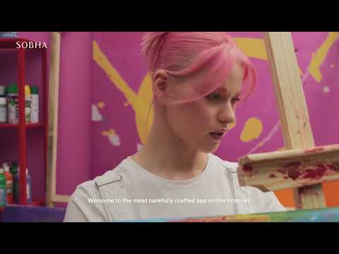
The execution follows a clear Setup-Turn-Payoff structure, though heavily weighted towards the setup. For the first 45 seconds, the audience is immersed in a series of visually rich, disconnected vignettes: a painter in a vibrant studio, a technician sculpting a logo from concrete, a UX designer in a futuristic lab, and a concierge in a whimsical, pink hotel. Each scene is a meticulously composed, color-saturated world, heavily influenced by the distinct aesthetic of filmmaker Wes Anderson. The voiceover reinforces this theme with words like 'crafted,' 'imaginative,' 'expertly devised,' and 'finely curated.' This prolonged setup builds a powerful, if abstract, feeling of precision and artistry. It doesn't sell an app; it sells an ideology. The 'Turn' is a simple but effective transition at 0:46, where a butler reveals the app on a silver platter, literally serving technology as a luxury. The final 'Payoff' is a rapid-fire showcase of the app's actual features—property management, amenity booking, etc.—before the final call to action. [4] This structure makes the ad feel more like a high-fashion film than a tech commercial.
The key debrief for the team is the success of this transference of brand values. The film makes a compelling case that Sobha's app isn't just another generic property portal but a digital embodiment of its luxury promise. [2, 5] The risk, however, lies in its pacing and ambiguity. By withholding the app's practical purpose for so long, the ad relies heavily on the viewer's patience and existing brand loyalty. For a current Sobha homeowner, the message likely resonates. For a prospective customer unfamiliar with the brand, the ad could come across as beautiful but confusing, failing to provide a clear reason to download until the very end. It's a solid piece of brand building that might be a less effective piece of performance marketing.
Theme Keywords
Brand Position
The only luxury developer that applies an artist's obsession with detail to every aspect of homeownership.
Brand Archetype
Creator
Creative Game Plan
Equate the meticulous craftsmanship of diverse art forms with the design and user experience of our new app, proving our brand's obsession with detail extends to digital.
Diagnosis: Issues & Solutions
Primary Issue: Strategic Sense
The Problem:
The ad spends nearly 85% of its runtime on abstract mood-setting and only 15% on the product's actual function. While this builds brand equity, it's an inefficient way to launch a new product, burying the lead and risking viewer drop-off before the core message is even delivered.
The Solution:
Integrate the 'what' with the 'why' earlier. For example, as the designer swipes the futuristic screen (0:15), an overlay could have read 'Seamless Amenity Booking.' This would have connected the artistic metaphor to a tangible benefit without breaking the visual style.
Secondary Issue: Emotional Connection
The Problem:
The hyper-stylized aesthetic creates a world that is admirable but emotionally cold and distant. The characters are more like artistic props than relatable people, making it difficult for a viewer to project themselves into the experience.
The Solution:
Conclude with a brief, authentic shot of a real resident in a recognizable Sobha property, using the app to effortlessly solve a problem (e.g., booking a tennis court) and looking genuinely pleased. This would ground the preceding fantasy in a relatable human benefit.