Taxi | It Starts with a Swipe™ - Ad Analysis

AI Editor notes
Straight from the gut!!
“Finally, a dating app ad that doesn't feel desperate or clinical. They're not selling features; they're selling a feeling. The rom-com trope is a smart hook, but the 'double send' reveal is the clever part. It’s relatable. It says, 'Yeah, it's a little clumsy online, but the end result can be just as romantic as a movie.' It works. It's charming without being cheesy.”
Quick Summary
This ad cleverly bridges the gap between the fairytale romance people want and the digital reality of how they get it. By staging a classic movie 'meet-cute' and then revealing it's a dramatization of a real, slightly awkward Tinder chat, the brand validates the modern dating process as the new, authentic starting point for love stories.
Executive Summary
Tinder's 'Taxi' is a smart piece of strategic communication that understands its audience's conflicted desires. The core insight is that while Gen Z is nostalgic for the idealized 'meet-cutes' of romantic comedies, their reality is digital, awkward, and mediated through screens. [1, 7] This ad doesn't force a choice between the two; instead, it validates the latter as the authentic path to the former. It’s a direct effort to reposition the brand away from its purely transactional, 'hookup app' legacy and toward a space of genuine, modern romance. [6]
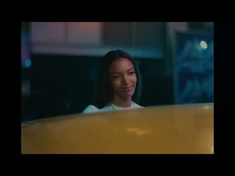
The execution follows a classic Setup-Turn-Payoff structure. The Setup is a perfect recreation of a rom-com trope: two strangers, a single taxi on a rain-slicked city night. The cinematic lighting, the dreamy music, and the cheesy opening line establish a familiar fantasy world. The Turn is the clever disruption. The dialogue repeats, the characters break their smooth facade with an embarrassed smile, and the on-screen text bubbles—"Sorry, double send"—shatter the movie illusion. This is the ad's most effective moment, pivoting from pure aspiration to relatable reality. It acknowledges the slightly clumsy nature of online flirting. The Payoff is the synthesis of these two worlds. The couple gets in the cab, their real, full conversation scrolling on the back window as the voiceover delivers the key message: "Meet cute happens every day on Tinder. Just not like they do in the movies." [8, 9] This final beat, along with the 'Inspired by real Tinder messages' card, provides the proof and reinforces the campaign's core idea: the fairytale ending is still possible, it just has a different beginning now.
The debrief for the team is this: authenticity sells, especially when it's wrapped in an aspirational package. The decision to use a real couple's first messages was the key to unlocking this idea. [9] It grounds the entire concept and prevents it from feeling like just another slick, generic love story. This ad works because it doesn't pretend that finding love on an app is as seamless as a Hollywood script. It embraces the small, human imperfections of the process and reframes them as charming, proving that the brand understands the nuances of modern dating.
Theme Keywords
Brand Position
The most popular and effective starting point for any kind of connection, from a moment to a lifetime.
Brand Archetype
The Lover
Creative Game Plan
Reframe awkward digital flirting as the charming, real-life beginning of a modern romantic comedy.
Diagnosis: Issues & Solutions
Primary Issue: Emotional Connection
The Problem:
The French dialogue is a lovely, romantic touch, but by leaving it untranslated, a layer of the 'meet-cute' fantasy is lost on the vast majority of the global audience who don't speak French. It creates a small barrier where there could be a stronger connection.
The Solution:
Add a simple, elegant subtitle (e.g., '[She speaks French]') or a subtle translated text overlay. This would let everyone in on the full romanticism of the moment without disrupting the visual flow, making the initial 'movie' setup even more potent before the reveal.
Secondary Issue: Strategic Sense
The Problem:
The ad does an excellent job romanticizing the outcome but spends very little time on the app experience itself, aside from the text bubbles. A competitor could easily replicate this format, making it less ownable for Tinder in the long run.
The Solution:
Incorporate a subtle visual of the iconic 'swipe' or 'match' animation in the opening seconds or as a transition. This could be integrated into the city lights or as a reflection, more firmly rooting the 'meet-cute' world within Tinder's specific user interface from the start.
Additional Notes
Related Links
Credits
Share this Analysis
More Tinder ad breakdowns
- Tongue Tied | Crushes | TinderTinder
- Tinder: Now with Instagram! | Product Release | TinderTinder
- Screaming Inside | Crushes | TinderTinder
- Rollercoaster | Crushes | TinderTinder
- Windswept | Crushes | TinderTinder
- Puddle | Crushes | TinderTinder
- Some things aren’t meant to last. Some things are | you up? | Tinder IndiaTinder
- It's all about finding someone who matches your effort 🥰Aisle