speed dating - Ad Analysis

AI Editor notes
Straight from the gut!!
“Finally, a real estate ad with a personality. It’s smart, funny, and avoids all the usual clichés of happy families running in slow motion through a new house. The 'speed dating' metaphor is just perfect—it's exactly what scrolling through endless, disappointing listings feels like. This is how a challenger brand should behave, even if they're a market leader. It shows they understand the customer's pain instead of just shouting about square footage.”
Quick Summary
This ad's power comes from a single, brilliant metaphor: apartment hunting is just as awful as modern dating. By dramatizing the search for a home as a series of comically bad dates, Morton taps into a universal frustration. It positions itself not just as a real estate company, but as the ultimate matchmaker that can find you 'the one'—an apartment that satisfies both your heart (love) and your head (calculation). The humor makes the brand memorable and relatable in a crowded market.
Executive Summary
In the typically bland landscape of real estate advertising, Morton’s “Speed Dating” is a masterclass in using a relatable metaphor to create distinction and connection. The ad operates on a simple, powerful insight that cuts through the noise: the exhausting, often demoralizing process of searching for a new home feels a lot like the modern dating scene. It’s a gauntlet of mismatches, disappointments, and options that are almost right but have one fatal flaw. This central idea is the engine that drives the entire spot, making it far more engaging than the standard fare of smiling families and generic property shots.
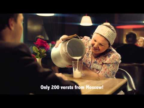
The execution follows a classic Setup-Turn-Payoff structure. The Setup is immediate: a nervous man at a speed dating event. The audience instantly understands the context. The Turn is the series of comically bad 'dates' that are revealed to be personifications of apartment problems. We meet the woman who is 'too expensive,' the one that needs 'a little cosmetic touch,' the one that's only available for 'rent,' and the one located '200 versts from Moscow.' This montage is the heart of the ad, using rapid-fire humor to build on the core insight. Each character is a perfectly cast archetype, from the sketchy 'black market' realtor to the girl who asks him to 'wait seven years.' The humor isn't just for laughs; it validates the viewer's own frustrations with the process. The Payoff arrives when the dejected protagonist is finally presented with the solution: not another person, but a sleek red door representing Morton. The voiceover solidifies the message, positioning Morton as the end of the frustrating search. The final tagline, 'apartments for love and by calculation' («квартиры по любви и по расчету»), brilliantly resolves the ad's central tension. It promises a home that satisfies both the emotional desire for a perfect fit and the practical need for a smart decision.
What the team behind this ad should learn is the immense power of a single, well-executed creative metaphor. Instead of telling the audience that the market is difficult, they showed it in a way that was entertaining and instantly recognizable. They didn't need to list features or show a single apartment. By focusing on the emotional truth of the customer's journey, they made the Morton brand feel like an empathetic guide rather than just another seller. This approach builds brand preference and memorability, which is a far more valuable asset in a crowded market than simply showcasing inventory. The lesson is clear: understand the customer’s real-world frustration and dramatize it. The solution will then feel less like an ad and more like a welcome relief.
Theme Keywords
Brand Position
The empathetic real estate partner that understands your frustrations and finds you the perfect match.
Brand Archetype
The Sage/Magician
Creative Game Plan
Dramatize the exhausting process of apartment hunting as a series of terrible speed dates to make the brand the one true match.
Diagnosis: Issues & Solutions
Primary Issue: Strategic Sense
The Problem:
The ad does a phenomenal job of building brand affinity but misses an opportunity to translate that feeling into a more tangible next step. The campaign is so memorable, but its energy dissipates at the final frame, which just shows a logo and URL.
The Solution:
Strengthen the connection between the creative idea and the product experience. A simple addition to the end card like, 'Stop the bad dates. Start a great match at Morton.ru/PerfectFit,' could have funneled the ad's energy into a specific, campaign-themed landing page, making the brand promise feel more actionable.
Secondary Issue: Emotional Connection
The Problem:
While the humor is excellent, the ad risks being remembered for the funny vignettes rather than the brand that solves the problem. The brand reveal is at the very end, and if a viewer is distracted, they might miss the payoff.
The Solution:
Introduce the brand element slightly earlier or more integrally. For instance, the red color of the final door could have been subtly seeded throughout the bar, or the Morton logo could have appeared on the table number stand in the final shot before the full brand reveal, creating a stronger link between the problem and the solution.
Additional Notes
Credits
Share this Analysis
More Morton ad breakdowns
- 3 Years From Now - Luxury Car for Edmont by Ashwin ShethEdmont by Ashwin Sheth
- Club Rasa | #FunFabulousFullOfLife | Piramal RevantaPiramal Realty
- PLENO TOWN บ้านนี้ดีอยู่แล้วรวย เริ่ม 1.79 ล้าน*Pleno Town
- Home Alone by AP TownhomeAP Townhome
- Birla Estates - Homes where every sq. ft. tells a story I RCBBirla Estates
- Unga Veedu, Love-ah? Arrange-ah?Navin's
- LUXURY FROM THE INSIDESC Asset
- Colinas Golf Residence - GolfColinas Golf Residence