SBI Contact Centre - Ad Analysis

AI Editor notes
Straight from the gut!!
“This is basically an animated flyer. It's clear, sure, but it has all the personality of a software update notification. It feels like a piece of internal communication that accidentally got posted publicly. For a brand that wants to be 'The Banker to Every Indian,' this is a missed opportunity to show a human touch. Who is this for? Someone who is already looking for the number, I guess. It’s completely forgettable.”
Quick Summary
This is a purely functional, no-frills public service announcement designed to inform existing customers about new, easier-to-remember contact numbers. It uses simple animation to clearly list the services available, prioritizing information delivery over creative engagement.
Executive Summary
This State Bank of India spot is a textbook example of communication at its most utilitarian. It's less an 'advertisement' in the traditional sense and more of a digital public service announcement. The core strategy is not to persuade or entertain, but simply to inform. Its objective, to publicize new, easier-to-remember toll-free numbers, is executed with straightforward, unadorned clarity.
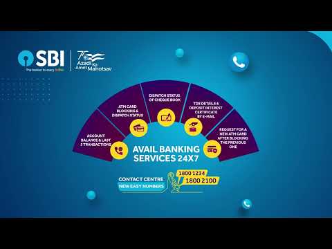
The execution follows a simple, educational format. There is no story or character; the product—the service line—is the hero. The structure is a direct 'Hook-Value-Proof' sequence tailored for a low-attention digital environment. The hook is the immediate presentation of the familiar SBI logo, signaling to customers that the information is relevant to them. The value proposition is delivered within the first three seconds: 'CONTACT CENTRE / NEW EASY NUMBERS'. This tells the viewer exactly why they should pay attention. The proof follows as an animated arc graphically demonstrates the specific services available, from checking balances to blocking a card. This visual list serves as a direct demonstration of the contact center's utility. The entire 26-second runtime is dedicated to reinforcing this core message, with the new numbers remaining on screen for the majority of the ad.
The most strategically significant element is the inclusion of the 'Azadi Ka Amrit Mahotsav' logo, which commemorates 75 years of Indian independence. This deliberately positions SBI, a state-owned bank, as an institution intertwined with the national identity. It elevates a simple service update into a message aligned with national pride and progress. However, this is the only element that provides any texture to an otherwise sterile execution.
The debrief for the team behind this would be a lesson in strategic trade-offs. The ad achieves its tactical goal with high efficiency. The message is unambiguous. Yet, in doing so, it forgoes any attempt to build brand affinity or create a memorable creative asset. It's a functional tool that will likely be effective in its narrow remit but will have zero cultural or emotional impact. It serves the customer, but it doesn't charm them.
Theme Keywords
Brand Position
The stable, dependable, and ubiquitous national bank for every Indian.
Brand Archetype
Ruler / Everyman. The brand's tagline, 'The Banker to Every Indian,' perfectly captures this duality: it is an authoritative, leading institution (Ruler) that is also accessible and essential for the common person (Everyman).
Creative Game Plan
Clearly announce our new, simpler contact numbers and visually list all the services you can access through them.
Diagnosis: Issues & Solutions
Primary Issue: Emotional Connection
The Problem:
The ad is completely devoid of a human element. It presents banking services as abstract functions on a screen, failing to connect them to the real-life needs and anxieties of customers.
The Solution:
Instead of a graphic of 'ATM Card Blocking,' show a quick, relatable vignette of a person realizing their card is missing, making a quick call, and feeling immediate relief. Frame the service as a solution to a human problem, not just a feature.
Secondary Issue: Memorability & Hook
The Problem:
The ad relies solely on the utility of the information as its hook. There is no creative device, sound, or visual to make the ad itself stick in the viewer's mind beyond the numbers.
The Solution:
A simple, recurring audio mnemonic—like a unique jingle or a voiceover repeating the numbers in a catchy way—could have dramatically increased the recall of both the ad and the information within it.
Additional Notes
Credits
Share this Analysis
More State Bank of India ad breakdowns
- A digital revolution made possible by the trust of a nation and the vision of SBI.State Bank of India
- Linking Lives, Empowering IndiaState Bank of India
- 🎉Celebrating the global cheers — your trust brought us to this throne!State Bank of India
- A Bank. A Legacy. One of the forces behind a Nation’s Rise.State Bank of India
- The year 2000 marked the beginning of a digital era at SBIState Bank of India
- Beware of Impersonators on Social Media!State Bank of India
- Banker to Urban & Rural IndiaState Bank of India
- Plan your wealth creation with SBI WealthState Bank of India