SBI Contact Centre - Ad Analysis

AI Editor notes
Straight from the gut!!
“Honestly, this is corporate wallpaper. It’s functional, sure, but utterly devoid of any humanity or creativity. It feels like an animated PowerPoint slide cooked up by a committee. For a brand that is 'The banker to every Indian,' it misses a massive opportunity to feel helpful, warm, or modern. It just feels... bureaucratic.”
Quick Summary
This is a purely functional piece of communication designed to do one job: drill two new, easy-to-remember customer service numbers into the minds of millions of customers. It sacrifices all creative ambition for the sake of absolute clarity, functioning more as a digital poster than a compelling advertisement.
Executive Summary
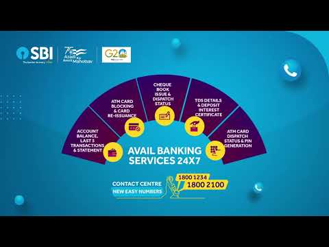
This State Bank of India spot is less of an advertisement and more of a public service announcement from the brand to its customers. Its core purpose is purely informational: to introduce two new, simplified toll-free numbers for its contact center. The strategy is one of brute-force clarity, stripping away any narrative or emotional layers to focus entirely on the message.
The Core Insight: The underlying insight is simple and sound: in a world of complex banking procedures, customers value simplicity and ease of access. For routine problems like checking a balance or blocking a lost card, a memorable, 24/7 phone number is a crucial service touchpoint. The choice of '1800 1234' is particularly smart, leveraging a sequential pattern that's easy to recall.
The Execution: The creative format is a straightforward 'Product Demo,' executed through clean, corporate 2D animation. There's no attempt at a narrative arc like a Setup-Turn-Payoff. Instead, the structure is a simple reveal. It opens by stating its purpose ('New Easy Numbers'), presents the solution (the numbers themselves), and then provides the reasons to believe by fanning out the various services offered. The visual of the unfolding fan of services is a decent, if uninspired, way to organize and present a list of features without resorting to boring bullet points. The music is generic, upbeat corporate stock audio, designed to be inoffensive and fill the silence. The entire execution prioritizes legibility over creativity.
The Debrief: The team behind this ad successfully delivered on a very narrow brief: make people aware of the new numbers. In that, it works. However, it represents a significant missed opportunity. Banking is often perceived as impersonal and bureaucratic, and this ad does nothing to counter that perception; in fact, it reinforces it. The brand failed to inject any warmth, humanity, or sense of relief that comes with solving a banking problem easily. This communication builds no brand equity. The lesson is that even the most functional message can be delivered with a touch of brand personality without sacrificing clarity.
Theme Keywords
Brand Position
The nation's most trusted and accessible bank for every Indian.
Brand Archetype
Ruler
Creative Game Plan
Clearly and simply announce our new, easy-to-remember contact numbers and visually list the key services you can access through them.
Diagnosis: Issues & Solutions
Primary Issue: Emotional Connection
The Problem:
The single biggest missed opportunity is the complete lack of a human element. The ad is sterile and impersonal, failing to connect with the real-world anxieties and needs of customers who would use a contact center.
The Solution:
Instead of abstract icons, show a quick vignette of a person in a relatable situation (e.g., realizing their card is missing) followed by their look of relief after a quick, successful call. This would ground the service in real human benefit.
Secondary Issue: Strategic Sense
The Problem:
The ad relies solely on media repetition for the numbers to become memorable. It lacks a creative device to make the numbers 'sticky' in the audience's mind.
The Solution:
Create a simple jingle or a mnemonic device incorporating the '1-2-3-4' sequence. Sound is a powerful tool for memory, and a catchy audio cue would have made the message far more effective and ownable.
Additional Notes
Related Links
Credits
Share this Analysis
More State Bank of India ad breakdowns
- A digital revolution made possible by the trust of a nation and the vision of SBI.State Bank of India
- Linking Lives, Empowering IndiaState Bank of India
- 🎉Celebrating the global cheers — your trust brought us to this throne!State Bank of India
- A Bank. A Legacy. One of the forces behind a Nation’s Rise.State Bank of India
- The year 2000 marked the beginning of a digital era at SBIState Bank of India
- Beware of Impersonators on Social Media!State Bank of India
- Banker to Urban & Rural IndiaState Bank of India
- Plan your wealth creation with SBI WealthState Bank of India