Rule the road with your favourite two-wheeler! - Ad Analysis

AI Editor notes
Straight from the gut!!
“This is about as basic as it gets. It feels like a PowerPoint deck turned into a video. There's zero emotion or creativity here. It's pure information delivery. Is it effective? Maybe, for someone already looking for a loan. But it's completely forgettable and does nothing to build the SBI brand. It's the kind of ad you scroll past without a second thought unless the specific offer—₹251 EMI—happens to catch your eye.”
Quick Summary
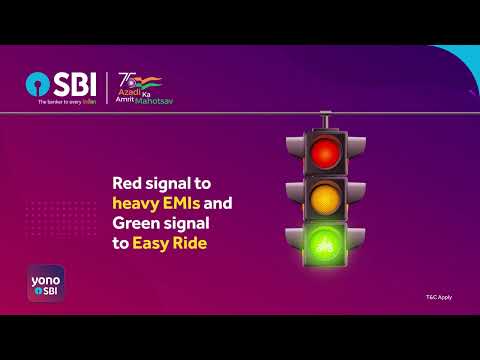
This is a straightforward, no-frills digital ad designed to do one thing: drive loan applications from existing SBI customers. It uses a simple traffic light metaphor to frame its 'Easy Ride' two-wheeler loan as the solution to the problem of high costs, laying out the core benefits and a clear call-to-action in under 30 seconds. It's a functional piece of performance marketing, not a brand-building exercise.
Executive Summary
This State Bank of India ad for its 'Easy Ride' two-wheeler loan is a textbook example of a lower-funnel, performance marketing creative. Its sole function is to convert awareness of a problem into a sales lead. It makes no attempt at storytelling, emotional connection, or sophisticated brand building. Instead, it operates as a simple, animated explainer video, prioritizing clarity and ease of access above all else.
The core insight is functional: potential borrowers are deterred by financial friction, specifically high monthly payments ('heavy EMIs') and complex application processes. The ad directly addresses these two pain points. The execution follows a classic Problem-Solution framework. The 'Problem' is established in the first five seconds with the 'Red signal to heavy EMIs' visual. This is a common and easily understood pain point for anyone considering a loan. The 'Solution' is immediately presented as the 'Green signal to Easy Ride,' positioning the product as the way forward. This traffic light metaphor, while generic, is universally understood and quickly communicates the core value proposition. The rest of the ad serves as 'Proof' and 'Call to Action.' The proof points are tangible and rational: a low EMI figure (₹251 per ₹10,000), the convenience of applying in a 'few clicks' via the YONO app, and the financial incentive of a 'Zero Processing Fee.' This structure is designed for quick comprehension on digital platforms where viewer attention is fleeting. The final screen is dedicated to a very specific, direct-response CTA: sending an SMS to check eligibility. This is a low-friction next step for its target audience of existing SBI customers, who are already in the bank's system. Tying the campaign to the 'Azadi Ka Amrit Mahotsav' initiative is a smart, low-effort way to add a veneer of national relevance and goodwill. [14]
The debrief for the team that created this would be straightforward: mission accomplished, within a very narrow scope. The ad successfully communicates the product's key benefits and provides a clear path for interested customers to take the next step. However, it's a piece of machinery, not magic. It completely lacks any brand personality or memorability. While effective for its immediate goal of lead generation for a new product launched in late 2021, it does nothing to build long-term brand equity or preference for SBI in a competitive market. [2, 3] It's a workhorse, built to deliver a specific result, and should be judged as such.
Theme Keywords
Brand Position
The most trusted and accessible bank for every Indian's financial needs.
Brand Archetype
Ruler
Creative Game Plan
Use a simple metaphor to frame our digital two-wheeler loan as the easy, affordable solution to the hassle of traditional financing.
Diagnosis: Issues & Solutions
Primary Issue: Emotional Connection
The Problem:
The ad is completely sterile and devoid of human context. By focusing entirely on abstract icons and text, it misses the opportunity to connect with the aspiration behind buying a two-wheeler—freedom, mobility, independence, a first vehicle. It sells the loan, not the dream.
The Solution:
Incorporate a simple, relatable human element. Even a 3-second animated clip of a character joyfully riding their new scooter through a green light would add a touch of emotion and make the 'Easy Ride' benefit feel more tangible and aspirational.
Secondary Issue: Strategic Sense
The Problem:
While the ad is clear, its visual execution is generic. The traffic light metaphor and basic motion graphics could be used by any financial institution. It does nothing to build a distinctive creative platform for SBI or its YONO app.
The Solution:
Develop a simple but ownable animated style or character that can be used across YONO product ads. Creating a consistent visual identity, even in low-budget performance creative, helps build brand recognition and distinctiveness over time.
Additional Notes
Related Links
Credits
Share this Analysis
More State Bank of India ad breakdowns
- A digital revolution made possible by the trust of a nation and the vision of SBI.State Bank of India
- Linking Lives, Empowering IndiaState Bank of India
- 🎉Celebrating the global cheers — your trust brought us to this throne!State Bank of India
- A Bank. A Legacy. One of the forces behind a Nation’s Rise.State Bank of India
- The year 2000 marked the beginning of a digital era at SBIState Bank of India
- Beware of Impersonators on Social Media!State Bank of India
- Banker to Urban & Rural IndiaState Bank of India
- Plan your wealth creation with SBI WealthState Bank of India