Royale Play Reimagine: Transform Your Space with Stunning Wall Textures! - Ad Analysis

AI Editor notes
Straight from the gut!!
“It's a product catalogue, plain and simple. But it's a very well-executed one. The 'new avatar' concept is a smart, direct way to address the fact that tastes have changed. They're trying to make textured walls feel chic again, not like something from a 90s sitcom set. It's all very safe and pretty, but for this kind of product, that's probably exactly what's needed.”
Quick Summary
Asian Paints is strategically repositioning its Royale Play textured paint line, moving it away from a legacy of loud, bold feature walls to a 'reimagined' collection that embodies modern luxury. The campaign aims to attract a more sophisticated, contemporary consumer by showcasing a new palette of subtle, elegant textures in aspirational, high-design settings.
Executive Summary
This campaign for Asian Paints’ Royale Play is a textbook example of a brand successfully pivoting its product positioning to align with evolving consumer tastes. It’s a strategic effort to shed the sub-brand's association with the somewhat dated, loud 'feature wall' trend of the 2000s and reintroduce it as a sophisticated tool for modern, understated luxury.
The Core Insight: The simple human truth at the heart of this ad is that our homes are our sanctuaries, and our tastes in decor have shifted. The desire for personal expression is no longer about shouting with bright colors, but about whispering with subtle textures and sophisticated palettes. The modern homeowner craves a space that feels curated, calm, and globally chic, yet with personal, unique touches.
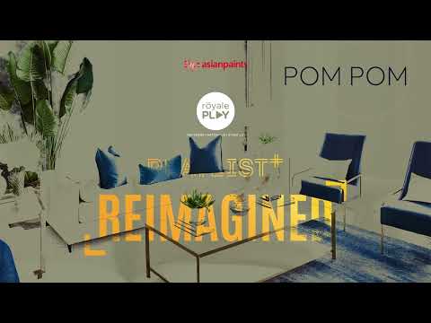
The Execution: The ad follows a simple and effective Hook–Value–Proof structure, functioning as a visually-led product demonstration. The Hook (0:00-0:07) cleverly uses a map of India to ground the brand in its heritage before showing quick cuts of the 'old' Royale Play style—vibrant, high-contrast walls that now feel slightly jarring. This sets up the problem. The Value proposition is delivered immediately with the title card “NOW IN A NEW AVATAR” (0:08). The entire aesthetic shifts to one of calm and sophistication, visually paying off the promise of something new and luxurious. This section clearly articulates the 'why'—the brand has evolved. The rest of the ad is dedicated to Proof (0:25-0:53), a clean, elegant montage showcasing the seven new texture families. By naming each texture ('Ikat', 'Linen', 'Fern') and showing it in a beautifully appointed room, the ad serves as an aspirational catalogue, allowing the product to be the undisputed hero. The execution is flawless in its simplicity, relying on high-end cinematography, a calming score, and impeccable interior styling to do the selling.
The Debrief: The key takeaway for the team is that clarity trumps complexity when launching a visual product. The ad succeeds because it doesn’t overthink its message. It clearly identifies a shift in taste, presents its product as the solution, and then provides beautiful, tangible examples. It understands that for this category, inspiration is the most powerful selling tool. The decision to remove human presence and focus entirely on the spaces was deliberate, turning the ad into a pure design lookbook. While this sacrifices some emotional warmth, it reinforces the product's status as a premium design element.
Theme Keywords
Brand Position
The ultimate tool for transforming walls from simple surfaces into sophisticated statements of personal style.
Brand Archetype
The Creator
Creative Game Plan
Visually demonstrate the evolution of Royale Play from bold and dated to subtle and sophisticated, positioning it as the essential choice for modern luxury interiors.
Diagnosis: Issues & Solutions
Primary Issue: Emotional Connection
The Problem:
The ad's environments are so perfectly styled and sterile that they feel more like museum exhibits than lived-in homes. This lack of human touch makes it difficult for a potential customer to emotionally project themselves into the space.
The Solution:
Incorporate subtle signs of life without distracting from the walls. A shot could include a person's arm resting on a sofa, a pair of reading glasses on a side table, or a pet walking out of frame. This would add a layer of warmth and relatability.
Secondary Issue: Clarity of "What's Next?"
The Problem:
The ad does an excellent job of creating desire for the product but fails to provide a clear, immediate next step within the video itself. The viewer is left inspired but un-directed.
The Solution:
Add a final frame with a simple, actionable call to action. Text such as 'Explore the Reimagined collection at asianpaints.com' or 'Visualize these textures in your home with our app' would effectively channel consumer interest into a tangible action.
Additional Notes
Credits
Share this Analysis
More Asian Paints ad breakdowns
- Asian Paints Tractor Emulsion – Tukka nahi Tractor - 20 sec GujaratiAsian Paints
- Asian Paints Terrace Waterproofing – Damp Proof - HindiAsian Paints
- Juice or shakes, no stress! Apcolite All Protek with Lotus Effect keeps walls stain-free | HindiAsian Paints
- Asian Paints SmartCare TVC - Waterproofing Solutions with Warranty (40 Seconds)Asian Paints
- Asian Paints Tractor Emulsion – Tukka nahi Tractor - 3+30 sec MarathiAsian Paints
- Asian Paints Apcolite All Protek - Daag Ko Daag Banne Hee Na De | 35 seconds - HindiAsian Paints
- Asian Paints Tractor Sparc - Budget Mein Fit, Shauk Ki No Limit.Asian Paints
- Asian Paints Tractor Sparc Emulsion – Budget Wala Paint (30 sec)Asian Paints