Royale Designer Pallete - Shvet by Royale - Ad Analysis
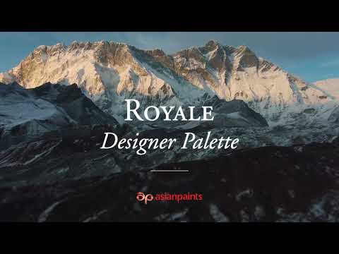

AI Editor notes
Straight from the gut!!
“This doesn't feel like a paint ad. It feels like a pitch for a luxury design house or a high-end perfume. It’s quiet, confident, and visually flawless. They're making a smart bet that their target audience is tired of loud, pushy ads and instead craves sophistication. Framing the inspiration journey with a Google search bar is a clever nod to how modern discovery works. The whole thing works.”
Quick Summary
Asian Paints successfully elevates the color white from a basic commodity to a premium, culturally significant design choice. By anchoring its 'Shvet' collection in the specific textures and tones of Indian heritage—marble from the Taj Mahal, Himalayan snow, jasmine flowers—the brand isn't just selling paint; it's selling taste, sophistication, and a connection to a timeless Indian aesthetic.
Executive Summary
In the world of home decor, 'white' is often the default, the safe choice, the absence of a decision. With its 'Shvet' campaign, Asian Paints reframes this perception entirely. This ad is a masterclass in elevating a commodity into a covetable luxury good by wrapping it in a powerful narrative of culture and heritage.
The Core Insight here is that for a discerning consumer, simplicity is the ultimate sophistication. The insight suggests that in a country with a rich visual history like India, even the color white is not a monolith; it has texture, history, and a story. The brand taps into a desire for products that are not just functional but are also meaningful and connected to a deeper identity.
The execution follows a clear AIDA (Attention, Interest, Desire, Action) model, delivered in a Lifestyle/Aspirational style. It grabs Attention not with a loud noise, but with a quiet, intriguing visual: a Google search bar overlaid on beautiful, almost abstract imagery. This modern framing device immediately positions the ad as a journey of discovery. Interest is built as the search reveals the sources of inspiration—the iconic marble of the Taj Mahal, the granular texture of salt flats, the purity of jasmine flowers. This grounds the abstract concept of 'white' in tangible, culturally resonant symbols. Desire is meticulously crafted in the ad's second half. The shift to perfectly curated interior spaces showcases the end result. By explicitly linking specific shades like 'Taj White' to their magnificent inspiration, the ad doesn't just show a painted wall; it shows a piece of heritage brought into the home. The Action is subtle. The final super, 'The Royale Designer Palette,' is the key takeaway. The objective isn't to get you to click a button in that moment, but to plant the seed of desire, ensuring that when you next think of painting, 'Royale' and 'Shvet' are top of mind as the sophisticated choice.
The Debrief for the team is a powerful reminder of the value of storytelling. This campaign demonstrates that you don't need celebrities or complex plots to create a premium brand. By identifying a compelling cultural truth and executing it with taste and restraint, you can transform the most basic product into something deeply aspirational. It proves that in marketing, the 'why' behind a product is often more compelling than the 'what'.
Theme Keywords
Brand Position
Royale is the connoisseur's choice for paint, offering not just colors, but curated palettes that transform a house into a home with a soul.
Brand Archetype
The Sage/Creator
Creative Game Plan
To reposition 'white' as a premium, storied design choice by linking it to the most iconic and beautiful white elements of Indian culture.
Diagnosis: Issues & Solutions
Primary Issue: Emotional Connection
The Problem:
The ad's execution is so flawless and its spaces so perfectly curated that it can feel slightly sterile and distant. The beauty is aspirational but lacks a human touch to make it feel truly like a 'home'.
The Solution:
Incorporate a single, fleeting shot of gentle human interaction within the space—a hand grazing the wall, the shadow of a person moving through the room, or someone quietly enjoying the ambiance—to add a layer of warmth and make the perfection feel more attainable and lived-in.
Secondary Issue: Clarity of "What's Next?"
The Problem:
While the ad excels at building desire, it leaves the viewer inspired but without a clear, immediate next step. The journey from inspiration to purchase is left undefined.
The Solution:
Add a simple, elegant text overlay in the final seconds, such as 'Discover the 45 shades of Shvet at asianpaints.com' or 'Find your heritage white with a Royale consultation'. This would bridge the gap between desire and action without compromising the ad's sophisticated tone.
Additional Notes
Credits
Share this Analysis
More Asian Paints ad breakdowns
- Asian Paints Tractor Emulsion – Tukka nahi Tractor - 20 sec GujaratiAsian Paints
- Asian Paints Terrace Waterproofing – Damp Proof - HindiAsian Paints
- Juice or shakes, no stress! Apcolite All Protek with Lotus Effect keeps walls stain-free | HindiAsian Paints
- Asian Paints SmartCare TVC - Waterproofing Solutions with Warranty (40 Seconds)Asian Paints
- Asian Paints Tractor Emulsion – Tukka nahi Tractor - 3+30 sec MarathiAsian Paints
- Asian Paints Apcolite All Protek - Daag Ko Daag Banne Hee Na De | 35 seconds - HindiAsian Paints
- Asian Paints Tractor Sparc - Budget Mein Fit, Shauk Ki No Limit.Asian Paints
- Asian Paints Tractor Sparc Emulsion – Budget Wala Paint (30 sec)Asian Paints