Retire your wallet with Tap to Pay | CRED - Ad Analysis

AI Editor notes
Straight from the gut!!
“This is a classic CRED move: high-style, high-production, and zero fluff. It's a pure product demo dressed in a designer suit. It's effective for its purpose—getting users to activate a feature—but it lacks the viral, talk-worthy weirdness of their celebrity campaigns. This feels less like a Super Bowl ad and more like a very, very cool in-app announcement video.”
Quick Summary
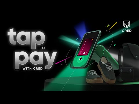
CRED uses slick, product-centric animation, reminiscent of an Apple launch, to introduce its 'Tap to Pay' feature. The ad squarely targets its existing tech-savvy user base by framing the physical wallet as obsolete and positioning the feature as a secure, seamless, and aspirational upgrade to their financial lifestyle.
Executive Summary
CRED’s 'Retire your wallet' is a masterclass in functional, product-as-hero advertising, executed with the brand's signature stylistic flair. Rather than continuing its well-known series of quirky, celebrity-driven brand campaigns, CRED here pivots to a pure Product Demo. The strategic choice to abandon narrative humor for sleek animation signals a clear objective: this isn't about acquiring new users who don't know what CRED is; it's about activating a specific, high-utility feature for its existing, tech-literate membership. The ad operates on a simple, powerful insight: for the modern, affluent consumer, the physical wallet is an unnecessary friction point. The entire creative is built around demonstrating how CRED elegantly solves this.
The execution follows a classic product demo arc, refined with the aesthetics of a premium tech launch. It begins with a strong visual metaphor—a physical wallet shattering—instantly establishing the problem and the brand’s disruptive solution. This is the Hook. The ad then moves into the Demo phase, methodically showing the user journey: an Axis Bank card is identified, seamlessly digitized within the app, and then used for a contactless payment. This sequence is crucial as it visualizes the simplicity of the setup and use case. Recognizing that security is the primary adoption barrier for any payment technology, the ad cleverly dedicates a significant portion of its runtime to building Proof. Supers like 'every tap is shielded' and the explicit mention of security protocols like 'Google HCE' and 'Guardsquare Dexguard' are not just jargon; they are direct trust signals to a skeptical and informed audience. The Payoff is a montage showcasing the feature’s universal application—paying for coffee, electronics, and fashion—under the simple banner, 'tap to pay. everywhere.' This montage transforms the feature from a technical function into a lifestyle enabler.
In the debrief, the team should recognize the power of this focused approach. When the goal is feature adoption, a clear, benefit-driven demo can be more effective than a high-concept brand film. CRED successfully traded the broad-based cultural buzz of its previous ads for surgical precision. The learning here is about knowing when to speak to the masses and when to speak directly to your core users in a language they understand and appreciate—one of seamless functionality and robust security. While it may not win awards for its emotional storytelling, it will likely succeed on the business metrics that matter for a product launch.
Theme Keywords
Brand Position
The most rewarding and sophisticated platform for trustworthy, high-credit individuals to manage their financial lives.
Brand Archetype
Ruler / Magician
Creative Game Plan
Visually render the physical wallet obsolete and establish CRED's 'Tap to Pay' as the most seamless, secure, and sophisticated way to make everyday payments.
Diagnosis: Issues & Solutions
Primary Issue: Emotional Connection
The Problem:
The ad is visually impressive but completely sterile. By focusing entirely on the technology and animated objects, it misses the opportunity to connect the feature's benefit to a human experience.
The Solution:
Incorporate a single, stylized shot of a person expressing quiet satisfaction or relief while making a swift payment in a busy environment. This would ground the technology's benefit in a relatable human moment without disrupting the ad's sleek aesthetic.
Secondary Issue: Strategic Sense
The Problem:
The ad's heavy focus on security details like 'Google HCE' might be lost on, or even intimidate, less tech-savvy viewers, potentially narrowing its appeal within the broader user base.
The Solution:
Simplify the security message. Instead of technical terms, use a more universally understood visual metaphor for security, like a fingerprint scan morphing into a shield icon, to convey safety without requiring technical knowledge.
Additional Notes
Related Links
Credits
Share this Analysis
More CRED ad breakdowns
- Not everyone gets it | Alka Yagnik and Udit Narayan | CREDCRED
- spoilt for choice | CRED garageCRED
- Great for the good | ft. Rahul Dravid | CREDCRED
- gratification beyond imagination ft. T. Rajendar | CREDCRED
- Great for the Good | ft. Neeraj Chopra | CREDCRED
- Not everyone gets it | Madhuri Dixit | CREDCRED
- Buzzkill ft. Leander Paes | CREDCRED
- Director’s Cut ft. David Warner & SS Rajamouli | CREDCRED