Presenting YONO by SBI - Lifestyle & banking, dono - Ad Analysis

AI Editor notes
Straight from the gut!!
“This feels like a bank trying to speak 'youth.' It's a frantic, feature-list-as-an-ad. The pace is exhausting, and while it definitely communicates that the app does a lot, it has zero personality. It's a PowerPoint presentation on steroids. I get the strategy—'we do everything so you don't need anyone else'—but it comes off as a utility, not something you'd actually want to engage with. It's functional, but entirely forgettable.”
Quick Summary
State Bank of India, a legacy banking giant, launched its YONO 'super app' to combat the rise of specialized fintech startups and recapture a younger, digitally-native audience. The core strategy is to consolidate a fragmented app landscape—from shopping and travel to investments and core banking—into a single, trusted platform, leveraging SBI's established brand credibility as its key differentiator.
Executive Summary
This launch campaign for YONO by SBI is a textbook example of a market leader flexing its muscles to enter a new space. Faced with the erosion of its younger customer base to nimble fintech apps, SBI's strategy was not to compete on a single vertical, but to create an entirely new one: the integrated banking and lifestyle 'super app'. The campaign's core insight is simple and potent: users are suffering from app fatigue. [3] The solution, YONO (You Only Need One), is positioned as the ultimate decluttering tool for your digital life.
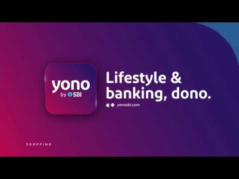
The execution follows a classic Problem-Solution structure, but with a relentless, feature-forward approach. It opens by establishing the shared pain point of a 'world cluttered with apps.' This is the setup. The 'turn' is the introduction of a simplifying force that merges 'lifestyle & banking.' The majority of the ad's runtime is dedicated to the 'payoff,' which is a dizzying, rapid-fire demonstration of every conceivable function, from booking flights to getting loans. This isn't storytelling; it's a brute-force information dump. The choice of kinetic typography and clean animation is purely functional, designed to deliver this list of features as efficiently as possible. The true strategic anchor, and the only moment of brand distinction, comes near the end with the simple parenthetical: '(From SBI)'. This is where the ad pivots from a generic tech demo to a powerful proposition. It's not just another app; it's an app from the most trusted bank in the country, implicitly promising security and reliability that startups can't match. The final tagline, 'Lifestyle & banking, dono' (dono meaning 'both' in Hindi), neatly summarizes the entire value proposition. [7]
The debrief for the team would be a lesson in strategic trade-offs. The campaign successfully announced the product and educated the audience on its immense scope. For a launch, this clarity is crucial. However, it achieved this by sacrificing any semblance of emotional connection or creative memorability. It's an ad that speaks to the brain, not the heart. While effective for an initial push, this purely rational approach has a short shelf life and does little to build a genuine brand personality for YONO beyond being an extension of its parent company. The work is competent and strategically sound for its objective, but it's not the kind of creative that builds long-term brand love.
Theme Keywords
Brand Position
The only app you need for your entire financial and lifestyle world, backed by the trust of India's largest bank.
Brand Archetype
Ruler
Creative Game Plan
Demonstrate overwhelming value by showcasing the sheer breadth of services available in one app to solve the modern problem of digital clutter.
Diagnosis: Issues & Solutions
Primary Issue: Emotional Connection
The Problem:
The ad is entirely transactional and devoid of a human story. By presenting a rapid-fire list of features through animation, it fails to create any emotional resonance, making the product feel like a cold utility rather than an integrated part of a person's life.
The Solution:
Center the next campaign around a single, relatable human story. Show one person's chaotic day—juggling multiple apps for food, travel, and payments—and how YONO seamlessly simplifies their life, leading to a moment of relief and satisfaction. This would transform the feature list into a tangible benefit.
Secondary Issue: Strategic Sense
The Problem:
The 'we do everything' approach, while comprehensive, risks making the app feel like a master of none. By showcasing dozens of features at a superficial level, it doesn't give the audience a single, compelling reason to choose YONO over a best-in-class specialized app they already use and love.
The Solution:
Isolate the single most compelling and differentiated feature (e.g., instant loans without paperwork, or exclusive integrated shopping deals) and build a dedicated mini-campaign around it. Proving superiority in one key area can build credibility more effectively than claiming competence in all of them.
Additional Notes
Related Links
Credits
Share this Analysis
More State Bank of India ad breakdowns
- A digital revolution made possible by the trust of a nation and the vision of SBI.State Bank of India
- Linking Lives, Empowering IndiaState Bank of India
- 🎉Celebrating the global cheers — your trust brought us to this throne!State Bank of India
- A Bank. A Legacy. One of the forces behind a Nation’s Rise.State Bank of India
- The year 2000 marked the beginning of a digital era at SBIState Bank of India
- Beware of Impersonators on Social Media!State Bank of India
- Banker to Urban & Rural IndiaState Bank of India
- Plan your wealth creation with SBI WealthState Bank of India