Our Contact Centre is always ready to help you out - Ad Analysis

AI Editor notes
Straight from the gut!!
“As a creative, this makes my eyes glaze over. It's the visual equivalent of hold music. But as a strategist, I have to respect it. When I've lost my card, do I want a clever joke or a cinematic masterpiece? No. I want a foolproof instruction manual. This is that. It’s boring, but it’s probably effective for its very specific, unglamorous job.”
Quick Summary
This is not an ad; it's a visual user manual. It completely trades creative engagement for functional clarity, aiming to solve a single, high-stress customer problem: a lost debit card. Its entire value lies in being a calm, step-by-step guide that builds trust by proving the bank's support systems are simple and accessible when a customer feels most vulnerable.
Executive Summary
This piece from State Bank of India is a textbook example of utility-focused marketing. It's less an advertisement in the traditional sense and more a public service announcement for its own customers. The core strategy is to address a specific, high-anxiety customer pain point—losing a debit card—with a clear, calming, and purely functional solution. The decision to use a simple 'Product Demo' format with clean animation is a deliberate choice to prioritize clarity over any form of creative flair. By doing so, SBI positions itself not as an aspirational brand, but as a reliable and accessible utility, which is a sound strategy for a market leader whose primary goal is retention and service.
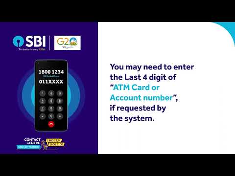
The execution follows a simple Problem-Solution-Proof structure. The Problem is implicit but universally understood: the panic of a lost card. The Solution is presented immediately: 'Call our Contact Centre & Block your ATM Card in just a few steps'. The remainder of the video, all 60 seconds of it, is the Proof. It meticulously walks the viewer through the entire IVR phone tree, showing which numbers to press on an animated phone keypad while reinforcing the steps with large, easy-to-read text. There is no subtext, no cleverness, no emotional manipulation. The soundtrack is generic corporate hold music, further reinforcing the idea that this is a functional process, not an emotional story. This clinical approach is its greatest strength and its most significant weakness. It provides unambiguous instructions but misses an opportunity to inject any warmth or brand personality into a moment when a customer might need reassurance.
The key debrief for the team is that while this approach is effective for its stated goal, it operates in a vacuum. It solves the immediate problem but does little to build a lasting positive association with the SBI brand. The execution is so generic that it feels like a stock template. The learning here is that function and brand feeling are not mutually exclusive. A slightly warmer voiceover, a more ownable visual style, or a stronger concluding message about security could have elevated this from a simple user manual to a piece of communication that both helps and builds brand affinity simultaneously.
Theme Keywords
Brand Position
The secure, dependable, and universally accessible 'Banker to Every Indian'.
Brand Archetype
Caregiver
Creative Game Plan
Visually demonstrate the card-blocking phone process with extreme simplicity to reduce customer anxiety and build trust in the bank's support systems.
Diagnosis: Issues & Solutions
Primary Issue: Emotional Connection
The Problem:
The video is entirely clinical and sterile. While it provides instructions, it does so without any human warmth, missing the chance to emotionally reassure a customer who is likely feeling stressed and vulnerable.
The Solution:
Replace the generic background music and on-screen text with a calm, reassuring human voiceover. Hearing a person's voice guiding you through the steps would add a layer of empathy and care that is currently absent.
Secondary Issue: Strategic Sense
The Problem:
The ad is so focused on the 'how' that it forgets to reinforce the 'why'. It demonstrates a process but fails to link it back to a larger brand promise about security or customer care, making the communication purely tactical, not strategic.
The Solution:
Add a strong closing statement that frames this feature within a larger brand context. For example: 'Your security is our priority. Day or night, SBI is here to help.' This connects the functional step to a core brand value.
Additional Notes
Related Links
Credits
Share this Analysis
More State Bank of India ad breakdowns
- A digital revolution made possible by the trust of a nation and the vision of SBI.State Bank of India
- Linking Lives, Empowering IndiaState Bank of India
- 🎉Celebrating the global cheers — your trust brought us to this throne!State Bank of India
- A Bank. A Legacy. One of the forces behind a Nation’s Rise.State Bank of India
- The year 2000 marked the beginning of a digital era at SBIState Bank of India
- Beware of Impersonators on Social Media!State Bank of India
- Banker to Urban & Rural IndiaState Bank of India
- Plan your wealth creation with SBI WealthState Bank of India