Movistar: Gravity 4 (English) - Ad Analysis

AI Editor notes
Straight from the gut!!
“It’s a 9-second visual snack. The levitation trick is a classic way to say 'fast' or 'light,' so it’s not exactly inventing anything new. But for this format, it's efficient. It communicates the idea of 'elevation' instantly. The strategy feels a bit abstract, but it's memorable enough for a skippable pre-roll ad. It gets the job done with zero fluff.”
Quick Summary
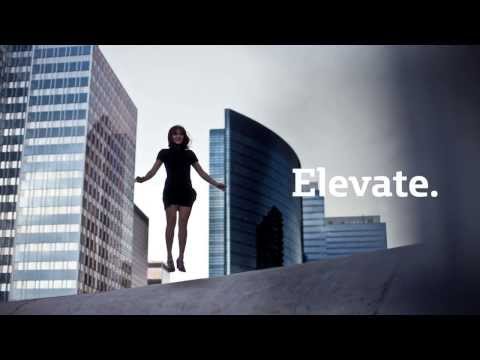
This ad uses a simple, elegant visual metaphor—levitation—to communicate the primary benefit of Movistar's new 4G LTE network: speed that 'elevates' your digital experience, freeing you from the gravity of slow connectivity. It's a pure, concept-driven piece of communication designed for quick comprehension.
Executive Summary
The Movistar 'Gravity' ad is a textbook example of using a simple, powerful visual metaphor to launch a new technology. In 2014, when 4G LTE was a significant upgrade, the challenge wasn't just to announce its availability but to make consumers understand its benefit in a tangible, non-technical way. The agency, Young & Rubicam Peru, bypassed jargon and spec sheets in favor of a single, aspirational feeling: elevation.
The core insight is that slow, unreliable connectivity feels heavy—it weighs you down. Conversely, fast, seamless service feels liberating, almost like defying gravity. This ad brings that abstract feeling to life. The execution follows a simple, effective arc perfect for its 9-second runtime. It begins with the 'problem': a woman on a cobblestone street, shot from above, looking down. The lighting and her posture suggest she's grounded, perhaps burdened. The moment the '4G LTE' identifier appears, the 'solution' begins. She starts to float, an immediate visual payoff that connects the technology to the feeling of weightlessness. The word 'Elevate' serves as the campaign's thematic anchor, explicitly stating the core promise.
The final scene, where she hovers peacefully in a vast, empty warehouse, solidifies the feeling of freedom and control. The choice of an old, worn armchair juxtaposed with her modern levitation creates a slightly surreal, memorable image. Crucially, the Movistar logo appears here, ensuring the brand owns this feeling of liberation. While the concept isn't entirely unique—tech brands often use metaphors of flight and lightness—its execution here is clean, artful, and perfectly paced for short-form media. It communicates its entire message visually, making it language-agnostic and instantly understandable. The ad doesn't try to tell a complex story; it delivers a feeling and links it to the brand, a smart and disciplined approach for a product launch.
Theme Keywords
Brand Position
The network that lifts you up and sets you free.
Brand Archetype
Magician
Creative Game Plan
Dramatize the liberating feeling of 4G speed by showing it literally defies gravity.
Diagnosis: Issues & Solutions
Primary Issue: Strategic Sense
The Problem:
The benefit of 'Elevate' is emotionally appealing but strategically vague. Any competitor could claim their network 'elevates' the user. The ad relies heavily on the final logo slate to connect the idea to Movistar, risking low brand attribution.
The Solution:
Integrate a brand-specific visual cue earlier in the ad. For example, the trail of light as she begins to float could subtly form the shape of the green Movistar 'M', or the sound design could incorporate the brand's sonic logo as she lifts off.
Secondary Issue: Clarity of "What's Next?"
The Problem:
The ad successfully creates desire for the 4G experience but provides no clear path for the consumer. After seeing the ad, the viewer understands the benefit but isn't told what to do with that information.
The Solution:
Add a simple, action-oriented text overlay in the final seconds, such as 'Upgrade to Movistar 4G today' or 'Experience the speed at movistar.pe'. This small addition would bridge the gap between awareness and consideration.
Additional Notes
Related Links
Credits
Share this Analysis
More Movistar ad breakdowns
- Somos GregariosMovistar
- Movistar 4G LTE Network: The flightMovistar
- Movistar: Peruvian CuisineMovistar
- Movistar: Backup address bookMovistar
- Look Behind YouVerizon
- Virgin Mobile Campaign keeps it simple and bets on good vibes themeVirgin Mobile
- Meet India's most unique auto driver | Fast & Curious | Ep. 1Airtel
- Good restaurant or Good Wi-Fi? – Get Airtel International Roaming!Airtel