Mad Genius 5.0 - Ad Analysis

AI Editor notes
Straight from the gut!!
“This is pure, uncut agency swagger. It's visually sharp and the motion work is solid, but it feels like it was made to be applauded by other designers, not to solve a client's problem. It screams 'look how creative we are' but doesn't bother to connect that creativity to business results. Who is this actually for? A CMO, or a rival agency's creative director?”
Quick Summary
This is a loud, confident, and aggressive rebrand announcement from a creative agency. It uses a high-energy motion graphics sizzle reel to showcase a new visual identity and aggressively position the agency as an edgy, modern, and unconventional partner for clients tired of the status quo.
Executive Summary
This video is less of an advertisement and more of a declaration. Mad Genius isn't just announcing a new coat of paint; they're launching a statement of intent. It's a B2B marketing piece aimed squarely at potential clients who feel their current agency is too safe, too predictable, and too corporate. The core of this work is a sizzle reel, a format chosen to bombard the viewer with the sheer energy and aesthetic confidence of the agency's new brand identity.
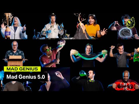
The core insight driving this is that in the commoditized world of creative agencies, differentiation is paramount. The name 'Mad Genius' itself suggests a productive tension between chaos and brilliance, and the agency is banking on clients being attracted to that edge. The execution is a frantic, but structured, demonstration of this new brand. It's not a narrative; it's a tour of a new toolkit. The hook is a set of provocative choices—'Shut Down Company,' 'Rebrand,' 'Release the Hounds'—that frames rebranding not as a simple refresh, but as a high-stakes, transformative act. From there, the video systematically reveals its assets: the 'Atomic Green' color, the new logo, the tagline 'Deliver the Unexpected,' and the typographic system. The middle section attempts to give meaning to this style, connecting words like 'Creative' and 'Curious' to abstract animations. This is where it risks becoming self-indulgent, a flurry of motion graphics that look impressive but say little. The payoff, however, is effective. Showing the branding applied to a website mock-up makes it tangible, and the final grid of employee portraits grounds the 'madness' in real people, adding a much-needed human element. The choice to show the team in playful, lab-themed scenarios reinforces the core brand idea perfectly.
The key takeaway for the Mad Genius team is that they have successfully crafted a loud and distinctive brand identity. The video proves they have the technical chops to create visually arresting work. However, the debrief should also note that the piece is heavy on style and light on strategic substance. It tells us that they are different, but not how their difference leads to better results for clients. The overwhelming energy could be perceived as noise by a more conservative client, making it a powerful filter that will attract exactly the kind of risk-tolerant partner they seem to be seeking, while likely alienating others.
Theme Keywords
Brand Position
The creative agency that harnesses strategic chaos to deliver unexpected brilliance.
Brand Archetype
The Magician (with a strong Outlaw streak)
Creative Game Plan
Visually overwhelm the audience with a new, aggressive brand identity to prove we are the bold, unconventional creative partner they've been looking for.
Diagnosis: Issues & Solutions
Primary Issue: Strategic Sense
The Problem:
The ad is heavy on 'how' the agency sees itself (creative, curious, etc.) but light on the 'why' for the client. It showcases its personality but fails to translate that personality into a clear value proposition for a business owner with a problem to solve.
The Solution:
Revise the kinetic typography section to connect each brand value to a client outcome. For example, instead of just flashing the word 'Curious,' the text could animate to say, 'Our Curiosity Uncovers Your Untapped Markets.'
Secondary Issue: Clarity of "What's Next?"
The Problem:
The video builds a huge amount of energy and then dissipates it by ending on a logo with no directive. It leaves the viewer impressed but inert, failing to channel their interest into a specific action.
The Solution:
Add a final, clean end card with a direct and simple call to action. A simple 'See the new brand in action at MadG.com' would provide a clear next step and capitalize on the momentum built by the video.