Louder than TB - Ad Analysis

AI Editor notes
Straight from the gut!!
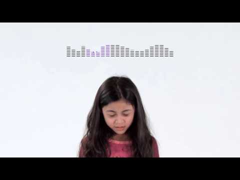
“This is tough to watch, and that's exactly the point. It's so simple—just a girl, a white background, and that awful breathing sound. It makes the silence around TB feel loud and uncomfortable. It's banking everything on one sharp, emotional jab. The big question is whether this visceral discomfort translates into action, or if it just makes people turn away before the final message lands.”
Quick Summary
This ad turns silence into a weapon. By making the audience hear the amplified sound of a child struggling to breathe from a supposedly "silent" epidemic, it transforms an abstract health statistic into an urgent, personal crisis that is impossible to ignore.
Executive Summary
The core insight of this campaign is that for most of the world, tuberculosis is a silent killer—not because it's quiet, but because no one is listening. The world's silence is a choice, and this ad argues that its consequence is 'deafening'. It’s a powerful reframing of a problem often lost in a sea of other global health issues.
The execution uses a classic Problem-Agitation-Solution structure, but with a minimalist, modern approach. The Problem is established immediately, not with a voiceover, but with the visceral, uncomfortable sound of a young girl's labored breathing. For the first 15 seconds, the viewer is forced to confront the physical reality of the disease while on-screen text frames this struggle as a result of global indifference: 'THE SILENCE AROUND TUBERCULOSIS IS DEAFENING.' The ad then Agitates this problem with stark data: 'YET IT KILLS 400 CHILDREN EVERY DAY. ONE CHILD EVERY 4 MINUTES.' These facts, layered over the continued image of the suffering child, turn a personal discomfort into a large-scale crisis. The problem isn't just this one girl; it's a global tragedy happening in plain sight. The Solution presented is conceptual, not medical. The text states, 'IT'S TIME TO FINALLY GIVE THIS EPIDEMIC A VOICE.' This positions the viewer as the agent of change. The problem isn't framed as a lack of a cure, but a lack of public outcry. The girl’s final, sharp intake of breath, followed by the hashtag 'TOGETHER WE CAN BE #LouderThanTB,' is the direct ask. The solution is for the audience to break the silence. [2]
The key lesson from this work is the power of restraint. By stripping away music, complex scenery, and multiple actors, the ad creates an uncomfortable intimacy between the viewer and the subject. The creative choice to make the central conflict an auditory one—the sound of suffering versus the world's silence—is incredibly effective. It's a strong example of using sound design not as a background element, but as the core creative idea.
Theme Keywords
Brand Position
The urgent advocate for the world's most overlooked deadly pandemic.
Brand Archetype
The Caregiver
Creative Game Plan
Make the world's silence on tuberculosis feel as suffocating as the disease itself.
Diagnosis: Issues & Solutions
Primary Issue: Clarity of "What's Next?"
The Problem:
The ad creates intense emotional energy and a desire to help, but the call to action—a hashtag and a URL—feels slightly disconnected from that visceral feeling. The path from using the hashtag to saving a life isn't explicitly clear, leaving the viewer's motivation without a precise, tangible outlet.
The Solution:
Strengthen the call to action with a more direct verb. For example: "TOGETHER WE CAN BE #LouderThanTB. *Demand action* at LouderThanTB.org." This connects the abstract idea of "being louder" to a concrete step the viewer can take on the website.
Secondary Issue: Emotional Connection
The Problem:
The ad's reliance on distress and discomfort risks alienating some viewers. While effective at grabbing attention, the negative emotional state it induces might cause people to look away or click off before the call to action appears, a common challenge for shock-based advertising.
The Solution:
Consider a bookend strategy for a longer campaign. After establishing the problem with this jarring ad, follow up with content showing the positive impact of "being louder"—stories of recovery or progress—to give the audience a sense of hope and tangible results.