Let's change the way we show our vote this #EqualsDay - Ad Analysis

AI Editor notes
Straight from the gut!!
“This is a solid piece of brand building. It's ambitious to link online shopping with the sanctity of the vote, but they pull it off. The core creative idea, turning the finger-point into an equals sign, is clever and memorable. It feels a bit like a 'brand anthem' from a big tech company, but the execution is so visually rich and authentically Indian that it earns its emotional weight. It's a smart way to say 'we're part of the national fabric' without being jingoistic.”
Quick Summary
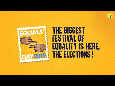
Flipkart successfully reframes a common gesture of division—the pointed finger—into a powerful symbol of unity: the inked voting finger. By inventing 'Equals' Day' during the 2019 Indian elections, the brand cleverly inserts itself into a major cultural moment, associating its e-commerce platform with the profound democratic value of equality without taking a political stance.
Executive Summary
Flipkart's 'Equals' Day' is a masterclass in brand positioning during a significant national event. Released to coincide with the 2019 Indian General Election, the campaign's goal was not to sell goods but to sell an idea: that Flipkart is a brand aligned with the progressive values of a modern India. It does this by tackling the inherent divisiveness of politics and finding a single, unassailable truth to champion—the equality granted by the vote.
The core insight is simple yet powerful: in a nation of immense diversity and frequent disagreement, the voting booth is the great equalizer. [1] Every citizen, regardless of their background, gets one vote, making election day a de facto festival of equality. This is the foundation upon which the entire creative is built.
The execution follows a classic Setup-Turn-Payoff structure. The first act sets up the 'pointed finger' as a universal symbol of accusation, blame, and division. Through a rapid montage cutting across India's diverse cultures, we see this gesture used in arguments, challenges, and debates, perfectly mirroring the heated climate of an election. The voiceover ironically calls this a 'festival'. The turn occurs when the narrative pivots to the inside of the voting booth. The chaos subsides, replaced by quiet contemplation. The accusatory finger becomes the finger that casts a vote. This is the moment the ad's thesis is revealed: 'don't we all become equal?'. The payoff is the brilliant creative leap. The ad proposes a new way to display the proof of voting—the inked finger. Instead of a lone finger held up, it encourages people to pair up and form an 'equals' sign (=). This transforms the symbol from a mark of individual participation into a gesture of collective unity. The final montage, showing diverse pairs of Indians creating this symbol, provides a powerful and visually satisfying conclusion to the argument.
The debrief for any brand team watching this is about the power of reframing. Flipkart and Dentsu Webchutney took a potentially divisive moment and found a universal, positive angle. [2] They didn't talk about politics; they talked about democracy. They didn't endorse a party; they endorsed the citizen. By inventing a new 'day' and a new social gesture, they created an ownable piece of culture that elevated the brand above the transactional nature of e-commerce and into the realm of national sentiment.
Theme Keywords
Brand Position
Flipkart is the homegrown e-commerce platform that champions the progressive, unifying values of a modern India.
Brand Archetype
The Citizen
Creative Game Plan
Transform the finger—a common symbol of political division—into a collaborative gesture of democratic equality to celebrate India's election.
Diagnosis: Issues & Solutions
Primary Issue: Strategic Sense
The Problem:
The primary strategic risk is the weak link between the message of democratic equality and the brand's core business of e-commerce. While emotionally powerful, a skeptical viewer could see it as opportunistic 'purpose-washing,' where the brand is borrowing interest from a national event without a genuine, tangible connection.
The Solution:
To bridge this gap, the campaign could have been connected to an on-platform action. For example, creating a microsite with voter registration information, or using their logistics arm, eKart, to help deliver essential supplies to polling stations, creating a real-world proof point for their message of civic partnership.
Secondary Issue: Brand Distinctiveness
The Problem:
The ad's high production value and generic 'national unity' theme, while effective, could have been produced by any number of large Indian corporations (a bank, a telecom, a legacy conglomerate). The only uniquely Flipkart elements are the logo and tagline at the very end.
The Solution:
Weave the brand's function more subtly into the narrative. For instance, showing a Flipkart delivery box in the background of one of the diverse household scenes, or featuring an eKart delivery person as one of the citizens forming the 'equals' sign, would have grounded the lofty message in the brand's everyday reality without being overt.
Additional Notes
Related Links
Credits
Share this Analysis
More Flipkart ad breakdowns
- Where Does Shraddha Shop for Ethnic Fashion?Flipkart
- Feel runway ready like Alia at India Ka Fashion Capital!Flipkart
- TVs that fit every budget! Only on Flipkart. #HarBudgetMeinQualityFlipkart
- EMIs now on Debit Card by Flipkart - India Chahe Jo, Hum Banaye Woh!Flipkart
- Are you buying a table, or a tabla? #BeFurniSureFlipkart
- Thank you to all those who made this happen, you know who you are 💛💜💚🧡Flipkart
- Flipkart Big Sale of Small ThingsFlipkart
- Flipkart Big Billion Days, Coming Soon!Flipkart