Kotex #ProgressFeelsLike - Ad Analysis

AI Editor notes
Straight from the gut!!
“This is a textbook 'brand purpose' anthem. It’s beautifully shot and emotionally charged. But it also feels like it's trying to tackle every single issue facing women in two minutes, which makes the message feel a bit sprawling. The link back to the actual product is almost an afterthought. Does buying Kotex pads help solve systemic inequality? It's a strategic stretch, and the consumer knows it. It’s a solid, if predictable, play from the 'femvertising' handbook.”
Quick Summary
Kotex is escalating its brand strategy from simply selling products to owning a challenging cultural conversation. The ad ties the physical discomfort of periods to the wider societal discomfort women have been forced to endure for generations. By positioning itself as a partner in the fight for progress—not just a provider of pads—Kotex is making an ambitious play for brand affinity among a generation that expects brands to stand for something more than their bottom line.
Executive Summary
This Kotex film, '#ProgressFeelsLike,' is a deliberate move to elevate the brand beyond product functionality and into the realm of cultural leadership. It operates on a simple, yet powerful, core insight: women have been conditioned to normalize discomfort in all its forms, and true progress only happens when that discomfort is confronted collectively.
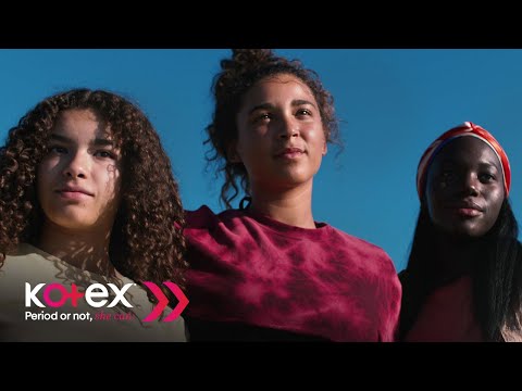
The execution follows a classic Setup-Turn-Payoff structure. The setup (0:00-0:35) masterfully establishes the baseline of quiet unease, showing women in everyday situations where they feel minimized or self-conscious. The voiceover, 'feeling uncomfortable is what we’re used to,' grounds the film’s grand theme in relatable moments. The turn (0:36-1:26) expands this personal discomfort into a historical and societal struggle. The film intercuts modern scenes—like the shame of a period leak or the pressure of beauty standards—with archival footage of protests, making the point that today’s anxieties are part of a long continuum. The line 'Progress is uncomfortable, but neither are we' acts as the crucial pivot, reframing discomfort not as a state to be endured, but as a fuel for change. The payoff (1:27-2:08) resolves this tension with a powerful visual metaphor. Women are shown carrying a heavy wooden plank, a symbol of their collective burdens, to the sea. They don't discard it; they transform it into a surfboard, riding the waves together in a moment of shared joy and liberation. This sequence visually communicates the campaign's ultimate message: that by facing burdens together, women can create freedom. The product itself makes only a fleeting, contextually relevant appearance—a pack of pads being hidden in newspaper—which is a smart choice. It acknowledges the brand's role in one specific area of discomfort without letting a hard sell derail the larger emotional narrative. This is a brand-building play, not a product demo, and the creative choices reflect that focus. The debrief for the team is that this is a strong foundation, but purpose-led marketing is a long-term commitment. The film makes a big promise; the brand must now follow through with tangible actions via its 'She Can Initiative' to prove its authenticity. [1] While the ad effectively captures a feeling, the challenge will be to ensure the Kotex brand is inextricably linked to that feeling in the consumer's mind, rather than being seen as another corporation co-opting a social movement.
Theme Keywords
Brand Position
The brand that unapologetically confronts the uncomfortable truths that hold women back, starting with the stigma around periods.
Brand Archetype
The Rebel
Creative Game Plan
Reframe the negative feeling of discomfort from a personal burden into a shared, powerful catalyst for collective progress.
Diagnosis: Issues & Solutions
Primary Issue: Strategic Sense
The Problem:
The ad's strategic scope is too broad. By attempting to address nearly every systemic issue women face—from workplace bias and beauty standards to domestic violence and restricted education—it risks diluting its core message and making the brand's role feel opportunistic rather than focused and authentic.
The Solution:
Narrow the focus to a territory Kotex can genuinely own. The campaign would be more powerful if it centered exclusively on how period stigma and period poverty are fundamental barriers to progress in education, sports, and the workplace, linking the brand's core purpose directly to a tangible pillar of the women's rights movement.
Secondary Issue: Clarity of "What's Next?"
The Problem:
The call-to-action, 'share what #ProgressFeelsLike,' is vague and places the burden of activating the campaign on the audience. It's a low-barrier ask that often results in low engagement and fails to connect the viewer's emotional response to a concrete, brand-related action.
The Solution:
Provide a clear and tangible next step. A more effective CTA would be to drive viewers to a specific hub for the 'She Can Initiative,' where they can learn about the non-profits Kotex is funding, see the impact of donations, or participate in a specific program. This converts passive sentiment into measurable brand engagement.