Hastings Direct 'Simplicity is the best policy’ - Ad Analysis

AI Editor notes
Straight from the gut!!
“It’s a smart visual gimmick. The animation is loud, chaotic, and definitely gets your attention. You feel the driver's pain. But the reveal of the 'simple' app feels like an anticlimax. The problem is a wild, roaring lion and the solution is... a tidy user interface. It makes the point, but the energy dies a sudden death. It’s effective, but not exactly exciting.”
Quick Summary
This ad uses a frenetic, mixed-media combination of live-action and animation to physically manifest the chaos of modern life. It creates a stark, memorable contrast to position Hastings Direct insurance not just as a product, but as a simple, calming sanctuary from that overwhelming complexity, all managed through a straightforward app.
Executive Summary
This Hastings Direct campaign is a direct assault on the perceived complexity of the insurance category. Its core insight is simple: people are overwhelmed by the chaos of modern life and crave simplicity wherever they can find it. The ad doesn't sell insurance features; it sells a feeling of relief. The strategy is to position Hastings Direct as the antidote to complexity, a pocket of calm in a frantic world.
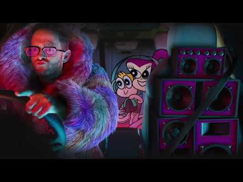
The execution uses a classic Problem-Solution framework, brought to life through a clever mixed-media approach. The 'Problem' is established immediately, both by the voiceover ('Life is complicated') and the visuals. The serene, live-action shot of a man driving is violently interrupted by an explosion of chaotic animated characters filling his car. These cartoons aren't random; they are metaphors for life's biggest stressors—messy relationships, demanding families, confusing trends. This visual device makes an abstract feeling—'complexity'—tangible and visceral. The live-action driver remains the calm center, the audience's anchor amidst the storm.
The 'Turn' happens when this chaos abruptly vanishes. The 'Solution' is presented: an animated, idealized version of the driver holding up the Hastings Direct app. The message is clear: our technology tames the chaos. The ad then provides the 'Proof' by showing the app's clean user interface, with simple options like 'Check your policy' and 'Make a claim.' The tagline, a clever play on a well-known proverb, seals the deal: 'Simplicity is the best policy.'
The key learning from this ad is the power of a strong visual metaphor. Instead of just saying insurance is complicated, they showed us what complication feels like. This creative choice makes the campaign far more memorable than a simple testimonial or feature list. However, the debrief for the creative team should address the energy drop in the second half. The 'problem' is a visual feast of color and motion, while the 'solution' is comparatively static and less engaging. The simplicity feels a little boring next to the exciting chaos. Future iterations could explore how to make the feeling of simplicity as visually dynamic and satisfying as the depiction of complexity.
Theme Keywords
Brand Position
The refreshingly simple insurance provider in a complicated world.
Brand Archetype
The Sage/Everyman
Creative Game Plan
Visually dramatize the overwhelming chaos of everyday life to make the straightforward simplicity of our insurance app feel like an essential relief.
Diagnosis: Issues & Solutions
Primary Issue: Emotional Connection
The Problem:
The ad masterfully illustrates a relatable problem (the stress of modern life) but the solution is presented as purely functional. The payoff is a rational one—'here is an easy-to-use app'—rather than an emotional one, failing to translate the resolution of chaos into a palpable feeling of peace for the viewer.
The Solution:
Instead of just having the animated chaos disappear, show a corresponding positive change in the driver's environment. When the animated characters vanish, the lighting could become warmer, the engine sound quieter, and the driver could give a visible sigh of relief. This would make the 'simplicity' a tangible, emotional reward, not just a feature.
Secondary Issue: Clarity of "What's Next?"
The Problem:
While the ad establishes the brand's positioning around simplicity, the call-to-action to download the app feels disconnected from an immediate need. The ad solves the abstract problem of 'life's complexity,' not the specific, urgent problem of needing car insurance right now.
The Solution:
A more direct call-to-action could be woven into the proof. For example, as the animated character shows the app, the voiceover could say, 'Get a quote in under 60 seconds and see how simple it is.' This provides a clear, immediate, and low-friction action for the viewer to take, directly demonstrating the 'simplicity' promise.
Additional Notes
Related Links
Credits
Share this Analysis
More Hastings Direct ad breakdowns
- Kapil Sharma Ki Advice: Car Insurance Kharido Sirf Policybazaar SePolicybazaar
- Set the mood. Watch belairdirect's hit music video "Safety On My Mind" !belairdirect
- Minimize your frustration: Triangle of AccidentRoojai
- Funniest Allianz Ad ever!!!Allianz Australia
- Budget Direct - Captain Risky's Pitstop - CinemaBudget Direct
- No Nonsense 'SmartDriver'No Nonsense
- Allianz: Stories - CarAllianz
- Mr. Rex - BedroomGPI Holding