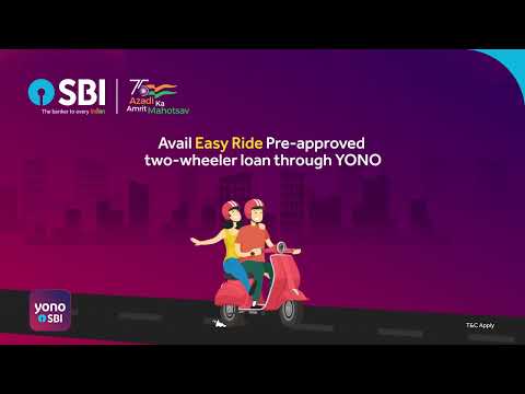
Drive towards happiness with your favourite two-wheeler! - Ad Analysis

AI Editor notes
Straight from the gut!!
“This is less of an 'ad' and more of a digital flyer. It’s completely devoid of charm or creativity. The animation is generic, and the 'Azadi Ka Amrit Mahotsav' logo feels like a corporate mandate. But, I have to admit, for someone who needs a scooter, that '₹251 per ₹10,000' is a hard number that cuts through the noise. It’s built for clicks, not for Clio awards.”
Quick Summary
This is a purely functional, performance-driven ad. It sacrifices creative ambition and emotional connection for absolute clarity on the offer: a two-wheeler loan with a tangibly low EMI, available through a simple digital process. Its entire purpose is to generate leads from high-intent customers who are already in the market for a scooter.
Executive Summary
This State Bank of India ad for its 'Easy Ride' loan is a textbook example of a performance-oriented digital asset. It is not designed to win creative awards or build deep emotional bonds with the brand; its sole purpose is to convert prospects into applicants with ruthless efficiency. The ad operates on a simple, rational premise, stripping away all narrative complexity to focus on the core value proposition and a clear path to action.
The creative approach is a straightforward Problem-Solution format, executed through simple 2D animation. The implicit problem is the financial barrier to owning a two-wheeler, a key symbol of freedom and convenience for many young Indians. The solution is presented not as a story, but as a series of clear, digestible facts designed to overcome purchase hesitations.
Its execution follows a classic Hook-Value-Ask structure, optimized for short attention spans on digital platforms. The Hook is immediate and tangible: 'Life is fun when EMI starts at ₹251 per ₹10,000.' This isn't a vague emotional promise; it's a specific, low number that makes the purchase feel achievable. For the target audience, this price point is the most critical piece of information. The Value proposition is then layered on with rational benefits: 'Pre-approved,' 'Loan in Few Clicks,' and 'Zero Processing Fee.' Each of these points directly addresses common pain points in the loan application process—long waits, complex paperwork, and hidden charges. The YONO branding reinforces the digital-first convenience. The Ask is the logical conclusion and perhaps the ad's strongest element. The final screen provides an explicit, low-friction call-to-action: 'SMS
The debrief for the team would be clear: the ad succeeds in its narrow goal. It effectively communicates a competitive financial offer and a simple conversion path. However, this efficiency comes at the cost of brand building. The work is generic and lacks any of the warmth or trust associated with the SBI master brand. While effective for short-term lead generation, this style of creative, if used exclusively, does little to build long-term brand preference and could allow competitors with more engaging creative to capture the hearts, if not the immediate clicks, of the audience.
Theme Keywords
Brand Position
The nation's most trusted and accessible bank, empowering every Indian's aspirations through modern, digital solutions.
Brand Archetype
Ruler
Creative Game Plan
Make scooter ownership feel immediately accessible by showcasing a low, digestible EMI and a frictionless digital application process.
Diagnosis: Issues & Solutions
Primary Issue: Emotional Connection
The Problem:
The ad is sterile and transactional. By using generic animation and focusing exclusively on financial terms, it misses the opportunity to connect with the feeling of joy and independence that comes with owning your first vehicle.
The Solution:
Incorporate a 3-5 second live-action clip of a relatable young person genuinely smiling and enjoying their new scooter. This would add a human touch and emotional payoff without compromising the ad's directness.
Secondary Issue: Brand Distinctiveness
The Problem:
The creative is so generic it could be for any financial institution. It relies solely on the SBI logo for branding, failing to leverage SBI's unique position as 'The banker to every Indian'.
The Solution:
Integrate a brand-specific message into the CTA, such as 'Start your journey with India's most trusted bank. SMS to apply.' This ties the functional offer to the master brand's core equity.
Additional Notes
Related Links
Credits
Share this Analysis
More State Bank of India ad breakdowns
- A digital revolution made possible by the trust of a nation and the vision of SBI.State Bank of India
- Linking Lives, Empowering IndiaState Bank of India
- 🎉Celebrating the global cheers — your trust brought us to this throne!State Bank of India
- A Bank. A Legacy. One of the forces behind a Nation’s Rise.State Bank of India
- The year 2000 marked the beginning of a digital era at SBIState Bank of India
- Beware of Impersonators on Social Media!State Bank of India
- Banker to Urban & Rural IndiaState Bank of India
- Plan your wealth creation with SBI WealthState Bank of India