Ceat Tyres_Life TVC - Ad Analysis

AI Editor notes
Straight from the gut!!
“This is a really smart, high-concept piece of work. It avoids every tyre advertising cliché—no speeding cars on wet roads, no families on vacation. Instead, it serves up a philosophical idea with a unique visual treatment. It's a bit cerebral, maybe, but it's confident and respects the viewer's intelligence. This is how you make a low-engagement category feel premium and thoughtful.”
Quick Summary
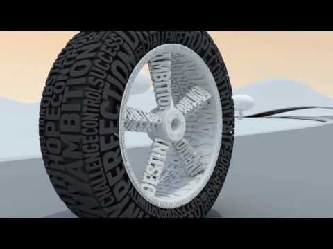
This ad successfully elevates a functional product into an emotional space by using a powerful visual metaphor. It equates the journey of life with the journey on the road, cleverly positioning Ceat's 'Superior Grip' not just as a physical attribute, but as the control needed to navigate life's challenges and opportunities. The unique typographic animation makes the message memorable and distinct.
Executive Summary
In the commoditized world of automotive tyres, advertising often defaults to well-worn tropes of safety, performance, or durability, usually demonstrated with screeching brakes in the rain. Ceat's 'Life's Journey' TVC sidesteps this playbook entirely, opting for a high-concept, philosophical approach that aims to build brand equity rather than drive an immediate sale.
The core insight is a simple but powerful human truth: people crave a sense of control over their unpredictable lives. The ad brilliantly translates this abstract desire into a tangible product benefit. The creative doesn't just sell tyres; it sells mastery over one's own path.
The execution follows a clean Setup-Turn-Payoff structure. The Setup immediately establishes the central metaphor: a tyre constructed from words like 'Hope' and 'Ambition' travels along a minimalist road. This isn't just a journey; it's a representation of a life's journey. The visual style—clean, 3D typographic animation—is crucial, creating a world that is both abstract and understandable. The Turn happens as the voiceover connects this visual to a philosophical message. The road itself becomes a series of typographic obstacles ('CHANGE', 'WORK HARD') and opportunities ('OPPORTUNITY'). The key moment, 'Know when to start and when to stop,' acts as the strategic pivot, framing control as the ultimate wisdom. The Payoff is the ad's most effective moment. The abstract, word-based tyre seamlessly transforms into a photorealistic Ceat tyre. The brand reveals itself not as a component, but as the enabler of the control we just heard about. The tagline 'Superior Grip' is thus elevated from a technical feature to 'a superior grip on your destiny.' The final Hindi tagline, 'Kahan rukna hai, pata hai' ('Knows where to stop'), perfectly lands this idea of intelligent control. [1]
What the team should learn from this is the power of a strong, central metaphor. By refusing to engage in a feature-for-feature battle with competitors, Ceat created a piece of communication that is ownable, memorable, and premium. It demonstrates that even the most functional products can be given an emotional soul if the creative is willing to move beyond the literal and into the conceptual. It’s a solid lesson in building a brand, not just advertising a product.
Theme Keywords
Brand Position
The tyre for those who seek control not just on the road, but in life.
Brand Archetype
The Sage
Creative Game Plan
Visualize the journey of life as a typographic road, and position Ceat's 'Superior Grip' as the tool for navigating it with control.
Diagnosis: Issues & Solutions
Primary Issue: Emotional Connection
The Problem:
The ad's greatest strength—its clean, conceptual execution—is also a slight limitation. By remaining in a cerebral, philosophical space, it connects with the viewer's intellect but may not create a deep, lasting emotional bond. It's admirable but a little cool to the touch.
The Solution:
Introduce a subtle human element at the very end. After the tyre transforms, a brief shot showing the reflection of a driver's confident eyes in the chrome rim could have grounded the abstract concept in a relatable human feeling without disrupting the minimalist aesthetic.
Secondary Issue: Clarity of "What's Next?"
The Problem:
The ad does a masterful job of building brand perception but offers no clear pathway for the interested consumer. The journey ends with the logo, leaving the viewer with a positive feeling but no direction.
The Solution:
A simple, unobtrusive URL on the final slate (e.g., 'ceat.com/grip') could have provided a destination for viewers intrigued by the 'all-new range of tyres' mentioned in the voiceover, bridging the gap between brand love and product consideration.
Additional Notes
Credits
Share this Analysis
More Ceat Tyres ad breakdowns
- CEAT SUV Tyres | Rohit Sharma, Shubman Gill and Shreyas IyerCEAT SUV Tyres
- No nonsense, only performance! Apollo Tyres Celebrates 10dulkar: An Ode to the Legendary PerformerApollo Tyres
- Apollo Apterra AT2 Tyres - Bad Roads Go To Good Places!Apollo Tyres
- Apollo Apterra Tyres: Unlock the True SUV in Your SUV | Apollo TyreApollo Tyres
- Nokian Tyres: Polar SummerNokian Tyres
- Feel the Bridgestone DifferenceBridgestone