Black Ink - Porsche 911 Carrera Black Edition models - Ad Analysis

AI Editor notes
Straight from the gut!!
“It's visually beautiful, no question. Very slick. But it also feels a bit cold and sterile, like a fragrance ad from the 90s. The 'car born from ink' concept is a solid creative device, but it lacks any human element. It's all head, no heart. I'm left admiring the execution more than desiring the car.”
Quick Summary
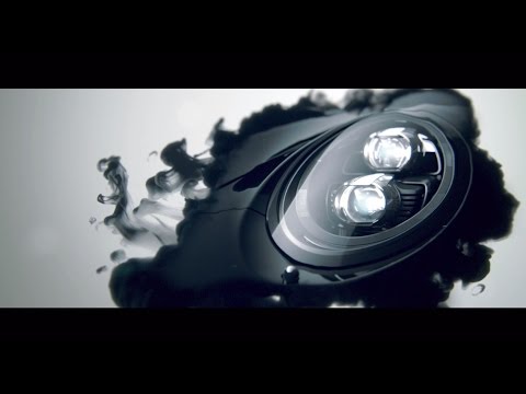
By transforming abstract black ink into a tangible Porsche 911, the ad positions the car not as a mere vehicle, but as a piece of timeless, functional art. It sells the idea of 'elegance' and 'design purity' to reinforce its premium status, making the specific 'Black Edition' feel like a curated, collectible object.
Executive Summary
This Porsche ad is an exercise in restraint and visual metaphor. It’s less of a car commercial and more of a short art film, designed to elevate a specific product—the 911 Carrera Black Edition—into the realm of high design. The strategy is to sell the car not on what it does, but on what it represents: timeless elegance. By avoiding roaring engines, winding roads, and smiling drivers, Porsche sidesteps the clichés of automotive advertising to reinforce its position as a market leader that competes on brand prestige rather than just performance specs.
The core insight is that for the target consumer, a Porsche is an object of desire and a statement of taste, much like a piece of art or a luxury watch. The simple idea of 'black' is elevated from a mere color choice to a philosophy. The description 'From an abstract form into an object of desire' perfectly encapsulates this journey from a pure idea (the ink) to a tangible, coveted product (the car).
The execution follows a clean 'Reveal' structure. It begins with an abstract and intriguing Setup: a single drop of black ink suspended in a white void (0:00-0:14). This creates a sense of purity and potential, grabbing the viewer's attention with its minimalist aesthetic. The Turn occurs as the abstract ink begins to coalesce and trace the iconic lines of the 911 (0:15-0:41). We recognize a headlight, a wheel, a fender. This is the magical transition where the conceptual becomes concrete, directly linking the idea of 'art' to the engineering of the car. The Payoff is the full, stunning reveal of the vehicle itself, followed by the super: 'Timeless Black. 911 Carrera Black Edition models' (0:42-0:51). This sequence doesn't just show you a car; it tells you a creation story, positioning the vehicle as the deliberate, final form of a perfect, elemental idea.
The debrief for the team is that this approach works exceptionally well for a brand that already holds a dominant market position. When you don't need to shout about your features, you can whisper about your philosophy. The ad successfully reinforces brand equity and makes the Black Edition feel special and collectible. [9, 10] However, the lack of any human element makes the work feel cold. While it impresses, it may not connect on a deeper, emotional level, which is a risk when passion is a key driver of purchase in the sports car category.
Theme Keywords
Brand Position
The ultimate synthesis of precision engineering and timeless design.
Brand Archetype
Creator/Ruler
Creative Game Plan
Equate the Porsche 911 Black Edition with a work of art by visually showing it being 'born' from the purest element of classic design: black ink.
Diagnosis: Issues & Solutions
Primary Issue: Emotional Connection
The Problem:
The ad's greatest strength—its clinical, artistic purity—is also its biggest weakness. It's aesthetically flawless but emotionally sterile. It leaves the viewer admiring the craftsmanship but feeling detached from the product, lacking the visceral thrill that should come with a Porsche.
The Solution:
Introduce a single, subtle human element. For instance, a brief shot showing the reflection of a subtly smiling driver in the car's flawless black paint, or the close-up of a hand appreciatively tracing the car's body line. This would add a layer of human desire without compromising the minimalist aesthetic.
Secondary Issue: Clarity of "What's Next?"
The Problem:
The ad makes a beautiful statement and then abruptly ends. For a viewer whose interest has been piqued, there is no guidance on what to do next. It's a dead-end in the customer journey.
The Solution:
Add a simple, elegant call-to-action at the end. A discreet URL like 'porsche.com/blackedition' or a simple phrase like 'Discover the collection' would provide a clear next step for motivated consumers without cheapening the artistic feel of the ad.
Additional Notes
Related Links
Credits
Share this Analysis
More Porsche ad breakdowns
- Porsche Korea | Sonderwunsch - Stay TunedPorsche
- Porsche x Eileen Gu | Taking the wheelPorsche
- Porsche Korea | 우리나라를 담은 최초의 마켓 에디션 이야기.Porsche
- "Mr. E" - Porsche TaycanPorsche
- Porsche Cayman: The world is a curvePorsche
- Porsche Macan: BelieverPorsche
- Hey Porsche, watch this video. Love, ElectricityPorsche
- Highspeed Orchestra: symphony of performance.Porsche