Bingo! Mad Angles - Board Room - Ad Analysis

AI Editor notes
Straight from the gut!!
“It's smart, dry, and perfectly cast. The deadpan humor is spot-on and it respects the audience's intelligence. Instead of shouting about taste, it creates a memorable, funny world around the product's unique shape. It’s the kind of ad that makes you smile and actually remember the brand name, which is half the battle won.”
Quick Summary
This ad is a masterclass in making the brand's name and core differentiator—'Mad Angles'—the hero of the story. By creating a ridiculously obsessive and 'mad' boardroom debate about the perfect triangle, the ad doesn't just sell the product; it *is* the product's personality. It established Bingo! as the quirky, clever alternative in a crowded snack market, building a brand identity that was far more valuable than simply announcing a new flavor.
Executive Summary
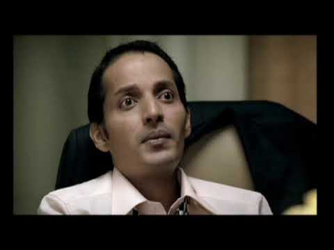
The ad drops us into a dimly lit, absurdly serious corporate boardroom. The setup is a creative presentation, but the subject isn't a billion-dollar merger; it's a single, triangular chip on a projector screen. The boss, a picture of weary authority, dismisses 'Opt. 3' with a flick of his hand. 'Kuch gadbad hai,' he mutters—'Something's wrong.'
The turn comes with his nonsensical feedback. He flips the triangle, inspects its angles with the intensity of a diamond cutter, and declares the new orientation 'sahi hai'—'this is right.' His sycophantic junior immediately agrees: 'Much better, sir.' The joke escalates when another executive points out it's the same thing, only to be silenced by a slap from a third. The boss then leads them in a bizarre ritual of rotating the chip, a pencil held in his teeth, searching for the perfect, indefinable angle. The entire exercise is pointless, obsessive, and utterly mad.
The payoff lands perfectly. A voiceover reveals the product: 'Bingo! Mad Angles Achari Masti.' The madness of the boardroom directly connects to the 'Mad' in the product's name. The ad wasn't just a random skit; it was a literal dramatization of the brand name. The final tagline, 'Har Angle se Mmmm...' ('Delicious from every angle...'), cleverly reinforces the product's shape and taste.
The strategic takeaway is simple but powerful: when your product has a unique name or feature, make that the entire story. Instead of just saying the chips were triangular and had a 'mad' new flavor, the ad embodied that madness. It didn't need a celebrity; the concept itself was the star. This approach helped the brand cut through the clutter of the snack market by being smarter and funnier than its competition, building a loyal following that appreciated its irreverent wit.
Brand Position
The snack for those who appreciate cleverness and don't take themselves too seriously.
Brand Archetype
The Jester. Personality: Witty, irreverent, and intelligently absurd.
Creative Game Plan
The core creative idea was to personify the product's name, 'Mad Angles,' by showing the 'madness' that goes into perfecting its unique triangular shape.
Diagnosis: Issues & Solutions
Primary Issue: Strategic Sense
The Problem:
The tagline 'No confusion. Great combination.' feels like a strategic mismatch with the creative execution. The entire ad is built on the premise of 'madness' and absurd, confusingly minute distinctions between identical angles. The tagline works against the core creative idea, attempting to inject rational clarity into a deliberately irrational world.
The Solution:
The tagline should have amplified the core idea of 'madness' instead of contradicting it. A line like 'Perfectly Mad. Perfectly Delicious.' or 'The Right Kind of Wrong.' would have been more consistent with the ad's tone and strengthened the overall brand message.
Secondary Issue: Clarity of 'What's Next?'
The Problem:
While the ad excels at brand building, the final product reveal could have been slightly more integrated. The graphic treatment at the end feels a bit tacked on after the strong narrative of the film.
The Solution:
A smoother transition from the live-action boardroom to the product shot could have made the link even stronger. For instance, the final 'perfect' triangle in the boss's mind could have seamlessly morphed into the actual product, making the connection between the creative idea and the physical snack even more direct.
Additional Notes
Related Links
- Bingo! Mad Angles now brings 'Har problem ka MMMMad solution' - Indiantelevision.com✓ Validated9/10AI Source
Credits
Share this Analysis
More Bingo! Mad Angles ad breakdowns
- CID's Biggest Mystery Yet: Bingo! Mad Angles Mystery PickleBingo! Mad Angles
- Mad About Triangles ft. Raghu Ram | Bingo! SnacksBingo! Mad Angles
- Bingo! Mad Angles - Mr. Grump | Har Mad Problem Ka Mad SolutionBingo! Mad Angles
- Brown Bear For Brown Bag: Au NaturaleLowes Foods
- When the crew became the cast… thanks to snacks! 🎬Bikano
- 24 Carat Taste | Beyond SnáckBeyond Snáck
- Medieval BattleSadia
- Failed DateGopal Snacks