BHIM - Bharat Ka Apna Payments App | Hindi - Ad Analysis

AI Editor notes
Straight from the gut!!
“Finally, a government-backed app ad that doesn't feel like a government-backed app ad. They're playing the long game here, focusing on emotion and culture instead of just features. It's a smart move in a cluttered market. The whole 'you've changed, but not that much' line is a clever way to address the user's hesitation with digital payments. It's reassuring. The real question is whether this warmth can overcome the aggressive cash-back and marketing muscle of its VC-funded competitors.”
Quick Summary
This campaign effectively positions BHIM not as a cold, transactional technology, but as a digital evolution of India's deep-rooted cultural relationship with money. By anchoring the new (digital payments) in the old (the value and respect for money, or 'paison ki kadar'), it builds trust and familiarity, making a government-backed app feel warm, personal, and intrinsically Indian.
Executive Summary
In the hyper-competitive Indian digital payments landscape, dominated by deep-pocketed private players, BHIM’s ‘Paison Ki Kadar’ campaign is a smart and effective piece of strategic communication. Instead of getting into a feature war or a discount battle it can't win, it wisely chooses to fight on the one ground it uniquely owns: being 'Bharat Ka Apna Payments App'—India's own. The campaign, conceptualized by Tilt Brand Solutions, is built on a powerful central insight: while technology changes how we handle money, the fundamental values, emotions, and traditions associated with it remain constant for most Indians. [2, 3, 4] This is the emotional anchor of the entire film.
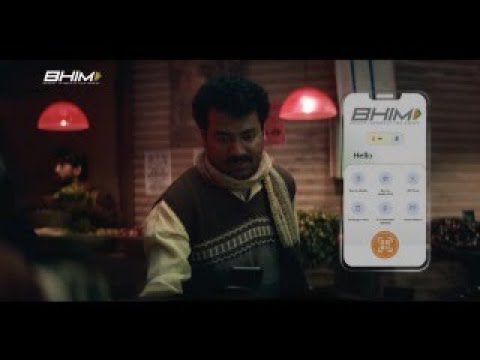
The execution uses a classic lifestyle montage, but elevates it with a poetic voiceover that directly addresses money as a person. This personification ('Paise... bade badal gaye ho yaar' / 'Money... you've changed a lot') is the creative hook that makes the concept relatable. The narrative structure is a simple setup-and-payoff repeated across several vignettes. The setup shows a modern payment interaction via the BHIM app—a QR code scan at a vegetable stall, splitting a bill among friends, or paying for bangles. The payoff connects this modern act to a timeless Indian value. For instance, the vegetable vendor receives her first digital payment of the day ('boni') and still touches the phone to her forehead in a sign of reverence, just as she would with cash. A group of elderly men uses the 'Split Expense' feature, but the core dynamic of friends arguing over who pays for tea remains unchanged. This repeated rhythm of 'You've changed, but not that much' effectively neutralizes the fear of the new by grounding it in the comfort of the familiar.
The production is high-quality, with a warm, authentic visual style that captures the diversity of India without feeling like a tourism brochure. It successfully showcases a range of the app's features—QR payments, Split Expense, multi-language support, and security—not through sterile demos, but by embedding them naturally into these human stories. [5] The team should learn that for a public-facing entity, building trust is paramount. This campaign demonstrates that the most effective way to build that trust is not by shouting about technology, but by whispering about shared culture and values. It’s a lesson in how to turn a potential weakness (being seen as a slower, government-backed entity) into a core strength (being seen as the most trustworthy and culturally aligned choice).
Theme Keywords
Brand Position
The trustworthy, homegrown Indian payments app that understands and respects your values.
Brand Archetype
The Everyman/Citizen
Creative Game Plan
Reassure Indians that adopting digital payments doesn't mean abandoning the cultural values and respect they hold for money.
Diagnosis: Issues & Solutions
Primary Issue: Strategic Sense
The Problem:
The campaign is almost entirely focused on brand building and emotional connection, which is a strength, but it does very little to communicate a unique functional benefit or a reason-to-believe *why* a user should switch from a competitor they already use daily.
The Solution:
While maintaining the emotional core, future iterations could subtly highlight a killer feature that competitors lack or execute poorly. For example, if BHIM's 'Family Mode' or 'Spend Analytics' are truly superior, one of the vignettes could have been dedicated to showcasing its tangible benefit in a user's life more explicitly, moving beyond just a quick UI shot.
Secondary Issue: Clarity of "What's Next?"
The Problem:
The ad successfully makes the viewer feel good about the brand, but the final CTA is a generic 'Download Now' screen. It misses an opportunity to translate the immense goodwill into a more compelling action or a continued conversation.
The Solution:
In a digital context, the CTA could lead to a landing page that continues the story, perhaps with user testimonials that echo the 'Paison Ki Kadar' theme. Or, it could highlight a specific, rewarding reason to download *today*, such as the KBC partnership mentioned in later campaign materials, to create more urgency. [8]
Additional Notes
Related Links
Credits
Share this Analysis
More BHIM (Bharat Interface for Money) ad breakdowns
- Turning Dreams into Smiles with the BHIM App - HindiBHIM (Bharat Interface for Money)
- Celebrate Meethi Diwali with BHIMBHIM (Bharat Interface for Money)
- A digital revolution made possible by the trust of a nation and the vision of SBI.State Bank of India
- Freedom At 1947 l Independence Day l Bandhan Mutual FundBandhan Mutual Fund
- Linking Lives, Empowering IndiaState Bank of India
- 🎉Celebrating the global cheers — your trust brought us to this throne!State Bank of India
- A Bank. A Legacy. One of the forces behind a Nation’s Rise.State Bank of India
- The year 2000 marked the beginning of a digital era at SBIState Bank of India