Better in Denim. - Ad Analysis

AI Editor notes
Straight from the gut!!
“This is a well-produced, high-energy throwback. It’s impossible to hate the vibe. But it feels like a meticulously crafted attempt to be cool, not genuine coolness. It's a textbook "Gen Z strategy" play: find a trending music group, license a Y2K track, and make a dance video. The problem is, you could swap the Gap logo for Old Navy or American Eagle, and it would still work. It's memorable content, but is it memorable *branding*?”
Quick Summary
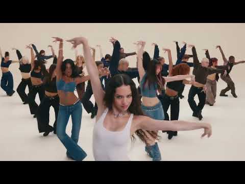
Gap is attempting to reclaim cultural relevance with Gen Z by rebooting its iconic, dance-based advertising formula from the early 2000s. It uses a trending girl group, a nostalgic hit song, and TikTok-style choreography to position its denim as the uniform for modern self-expression.
Executive Summary
Gap's 'Better in Denim' is a calculated and energetic attempt to recapture the brand's former glory by speaking the language of today's youth: music, dance, and nostalgia. This campaign isn't just selling jeans; it's selling a feeling of relevance. By enlisting the global girl group KATSEYE and setting the action to Kelis's enduring 2003 hit "Milkshake," Gap is making a direct play for the hearts, minds, and wallets of Gen Z. [1, 9]
The Core Insight here is that for a generation fluent in TikTok, self-expression is kinetic. Fashion isn't just worn; it's performed. The simple human truth is that people want to feel confident and free in their clothes, and this ad visualizes that freedom through relentless, joyful movement.
The Execution follows a classic Lifestyle/Aspirational model, structured less as a narrative and more as a pure vibe. The setup is immediate: the iconic song and dynamic dance grab attention within the first three seconds. The core of the ad is a sustained demonstration of the product in action, with the diverse cast showcasing a wide array of denim styles—from low-rise jeans to skirts—through intricate choreography. [4, 7] This serves as both an aspirational lifestyle showcase and a subtle product demo, proving the denim can handle a full range of motion. The payoff is the final group shot and the simple, confident tagline, "Better in Denim," followed by the Gap logo. The strategy is to associate the energy of the performance with the brand. However, the brand itself is almost entirely absent until the final seconds, a risky choice that prioritizes the cool factor over brand recall.
The Debrief for the marketing team should be mixed. On one hand, they successfully created a high-energy, shareable piece of content that taps directly into current cultural trends. [11] The collaboration with KATSEYE is a smart way to borrow relevance. [1] On the other hand, the work lacks a unique brand signature. It feels like an execution from a playbook that any of their competitors could have used. The biggest lesson is that while adopting cultural trends is effective for getting attention, it's not a substitute for having a distinct brand point of view. The ad revives a classic Gap formula, but in doing so, it highlights how much the market has changed; what was once ownable for Gap is now a common tactic in the fast-fashion world.
Theme Keywords
Brand Position
The definitive source for classic, optimistic American style that enables self-expression.
Brand Archetype
The Everyperson
Creative Game Plan
Associate Gap denim with the infectious energy of dance and the cultural currency of Y2K nostalgia to make the brand feel fresh and relevant to a new generation.
Diagnosis: Issues & Solutions
Primary Issue: Strategic Sense
The Problem:
The ad is a 'ghost ad'—it feels so generic that it could be for any number of fashion retailers. The Gap brand has no ownable role in the creative beyond the final logo slate, making it highly forgettable as a piece of Gap advertising.
The Solution:
Integrate a distinctive brand asset throughout the spot. This could be as simple as having one of the key dancers wear a vintage Gap logo hoodie, or subtly embedding the iconic three-letter logo into the set design to burn the brand into the viewer's mind without disrupting the creative.
Secondary Issue: Clarity of "What's Next?"
The Problem:
The campaign generates significant energy and interest but provides the viewer with no outlet for that engagement. There is no call to action—no website, no hashtag, no prompt to discover the collection.
The Solution:
Add a simple, direct call-to-action on the final card, such as 'Discover the collection at Gap.com' or 'Shop the look #BetterInDenim.' This provides a clear path for consumers whose interest has been piqued, bridging the gap between awareness and consideration.
Additional Notes
Related Links
Credits
Share this Analysis
More Gap ad breakdowns
- Give Your GiftGap
- The Hailey Jean: 1996Gap
- あなたならどう着る?LEVI'S FEATURING NEWJEANS | Levi'sLevi's
- Everyday Wear for Mr. Dependable featuring Rahul DravidUniqlo
- UNIQLO Premium Linen Shirt Collection featuring Kareena Kapoor KhanUNIQLO
- Levi’s featuring NewJeans | Levi’sLevi's
- Levi’s® RAMADAN 2019 (Full version)Levi's
- Levi’s® Hidup PositifLevi's