Bellroy: Designed for the Better - Ad Analysis

AI Editor notes
Straight from the gut!!
“This is just so... tidy. It's like ASMR for anyone who's ever fought with a bulky wallet or a tangled mess of keys. The strategy is dead simple and it works because the execution is so clean. It's not trying to be epic or emotional, it's just showing you, very clearly, how it can fix a small, daily annoyance. It respects my intelligence and makes me want to immediately organize my life. Solid, smart work.”
Quick Summary
This ad succeeds by transforming the mundane frustration of a messy bag or fat wallet into a visually satisfying spectacle. It uses a clean, direct 'problem-solution' format, combining charming animation with crisp stop-motion to prove its core promise: Bellroy's thoughtful design brings simplicity and order to your life. The product isn't just shown; its value is demonstrated in a way that's impossible to ignore.
Executive Summary
Bellroy’s “Designed for the Better” is a textbook example of how to execute a problem-solution campaign with precision and charm. It operates on a simple, powerful insight: the small, daily frictions from our personal effects—a bulky wallet, jangling keys, a chaotic bag—create a significant, if subconscious, mental load. We crave simplicity and order. The ad doesn't just sell wallets and bags; it sells the feeling of relief that comes from solving these tiny, persistent problems.
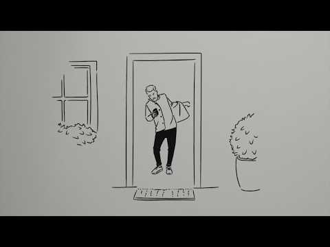
The execution is structured as a clear, two-act play. Act One, 'The Struggle,' uses simple line animation to depict a universally relatable scene of frustration. A character is trapped in a doorway, encumbered by his stuff. This animated approach is smart; it feels universal and lighthearted, preventing the problem from feeling overly dramatic. Act Two, 'The Solution,' shifts the visual style entirely to crisp, satisfying stop-motion against clean, colorful backdrops. This is where the ad's magic lies. It’s not just a product demo; it’s a series of mesmerizing 'before and after' vignettes. We see the exact same number of cards fit into a wallet that’s half the size. We see a tangled mess of keys become a silent, sleek fob. Each sequence is a mini-drama with a deeply satisfying resolution, proving the product's value without a single superlative. The upbeat, rhythmic soundtrack and sharp sound design amplify the feeling of order being restored.
The debrief for the team that made this would be a lesson in the power of clarity and demonstration. The ad succeeds because it resists the temptation to over-explain or to layer on complex emotional narratives. It trusts the intelligence of its audience to connect the dots. The product is the hero of the story, and its superpower is thoughtful design. This ad built a strong foundation for the Bellroy brand, establishing a visual identity and a core message of 'slimming your carry' that would define them for years. It proves that you don't need a massive budget or a celebrity to make an impact; a genuinely good idea, clearly demonstrated, is often more than enough.
Theme Keywords
Brand Position
The considered, elegant solution to streamline your everyday carry.
Brand Archetype
The Sage/Creator
Creative Game Plan
Visually demonstrate how Bellroy's thoughtful design eliminates the chaos of everyday carry, transforming frustration into satisfaction.
Diagnosis: Issues & Solutions
Primary Issue: Emotional Connection
The Problem:
The ad is hyper-focused on the functional 'relief' of organization but stops short of showing the human benefit. We see the problem and the fix, but not the 'after' state for the person. The initial animated character disappears after the problem is established.
The Solution:
After the product solutions are shown, briefly return to the animated character, who now glides effortlessly out the door. This would close the loop and translate the product's functional benefit (organization) into a human benefit (a smoother, better day).
Secondary Issue: Clarity of "What's Next?"
The Problem:
The ad concludes with a beautiful lineup of the products and the brand logo, which is elegant but passive. For a viewer new to the brand, the immediate next step is not explicitly signposted.
The Solution:
A simple, non-intrusive addition of the bellroy.com URL on the final screen would provide a clear and immediate pathway for interested customers to explore the collection without cheapening the brand-building feel of the ad.