Asian Paints Terrace Waterproofing – Damp Proof - Hindi - Ad Analysis

AI Editor notes
Straight from the gut!!
“This is advertising bread-and-butter. It's a problem-solution spot that’s as subtle as a hammer. The happy neighbor dancing is a bit much, but I get it. They're selling a feeling: freedom from a chronic, annoying household problem. It's not going to win creative awards, but for a category like waterproofing, maybe clear and direct is all you need. It feels like an ad that was built to work, not to be loved.”
Quick Summary
This ad uses a classic, simple 'neighbor's envy' narrative to position Asian Paints Damp Proof as the smart, permanent solution to the recurring frustration of leaky roofs. By directly contrasting the carefree, warrantied customer with the stressed-out user of generic 'chemical waterproofing,' it makes its core value proposition—long-term peace of mind—immediately clear in under 25 seconds.
Executive Summary
Asian Paints’ spot for its SmartCare Damp Proof is a textbook example of problem-solution advertising. It’s a short, sharp, and strategically sound piece of communication that forgoes creative flourish in favor of a message so clear it’s impossible to miss. The work is grounded in a simple truth: homeowners are deeply frustrated by temporary fixes for persistent, costly problems like terrace leakage, a common issue in India especially ahead of the monsoons. [1, 2]
The Core Insight here is that peace of mind is the ultimate product. The customer isn't just buying waterproofing paint; they're buying an end to a recurring, seasonal argument with their spouse, an end to wasted money on ineffective solutions, and the freedom to not worry every time it rains. The ad understands that the pain point isn't just dampness, it's the cyclical stress that comes with it.
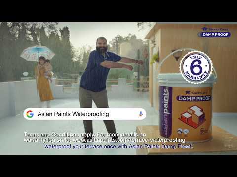
The Execution follows a classic Problem-Solution structure, amplified by direct comparison. It spends the first half of its brief 24-second runtime establishing the Problem. We see a man, visibly stressed, dealing with yet another round of 'chemical waterproofing' while his wife voices her frustration. This scene is instantly relatable to the target audience. The Solution is then introduced not through a technical explanation, but through an aspirational caricature: the happy neighbor. He is literally dancing, carefree on his pristine terrace. This contrast is the engine of the ad. The final act delivers the Proof: the voiceover explicitly names the enemy ('chemical waterproofing'), presents the hero product, and lands the knockout blow with the '6 Year Warranty'—a hard, tangible reason to believe. The closing shot of the previously frustrated man now dancing in the rain brings the transformation full circle.
The Debrief for the team is that for certain categories, surgical clarity trumps creative subtlety. This ad works because it identifies a single enemy, presents a single solution, and offers a single, powerful proof point. It doesn't try to be clever or overly emotional. It respects the viewer's time and intelligence by getting straight to the point. While it may not be the most distinctive creative in the brand's portfolio, its strategic discipline is what makes it effective. It’s a functional ad for a functional product, and it executes its limited mission well.
Theme Keywords
Brand Position
The smart, reliable choice for a permanent, stress-free solution to home problems.
Brand Archetype
The Sage
Creative Game Plan
Demonstrate the superior peace of mind our warrantied product provides by contrasting it with the endless frustration caused by inferior, generic solutions.
Diagnosis: Issues & Solutions
Primary Issue: Emotional Connection
The Problem:
The ad successfully captures the negative emotion of frustration but fails to create a genuinely appealing positive emotion. The 'happy neighbor' is a flat caricature, dancing alone on a roof. His joy feels hollow and staged, weakening the aspirational pull of the 'after' state.
The Solution:
Instead of showing a man dancing alone, visualize the real-life benefit of a waterproof terrace. Show a family enjoying a cup of tea on the terrace while it drizzles outside, or kids playing without interruption. This would ground the emotional payoff in a more relatable and desirable reality.
Secondary Issue: Brand Distinctiveness
The Problem:
The 'us vs. them' neighbor comparison is a very common advertising trope. While effective, it makes the ad feel generic. If you swapped the logos at the end, it could almost be for a different home improvement brand. The only truly distinct element is the warranty mention.
The Solution:
Incorporate a more unique and ownable brand asset. Asian Paints often uses specific color palettes or jingles. A more memorable musical signature or a visual motif beyond the product bucket could have made the ad feel more uniquely 'Asian Paints' and less like a generic category ad.
Additional Notes
Related Links
Credits
Share this Analysis
More Asian Paints ad breakdowns
- Asian Paints Tractor Emulsion – Tukka nahi Tractor - 20 sec GujaratiAsian Paints
- Asian Paints Terrace Waterproofing – Damp Proof - HindiAsian Paints
- Juice or shakes, no stress! Apcolite All Protek with Lotus Effect keeps walls stain-free | HindiAsian Paints
- Asian Paints SmartCare TVC - Waterproofing Solutions with Warranty (40 Seconds)Asian Paints
- Asian Paints Tractor Emulsion – Tukka nahi Tractor - 3+30 sec MarathiAsian Paints
- Asian Paints Apcolite All Protek - Daag Ko Daag Banne Hee Na De | 35 seconds - HindiAsian Paints
- Asian Paints Tractor Sparc - Budget Mein Fit, Shauk Ki No Limit.Asian Paints
- Asian Paints Tractor Sparc Emulsion – Budget Wala Paint (30 sec)Asian Paints