Asian Paints Royale Glitz | Special Edition Pack - A tribute to Odisha - Ad Analysis

AI Editor notes
Straight from the gut!!
“This is a beautiful, thoughtful piece of work. Instead of just slapping some regional motifs on a can, they've built a whole narrative world around it. The animation is the star. It feels respectful, not like a cynical marketing grab. My only question: at over two minutes, who is this really for? It's a long, artistic journey for a hardware product. It will kill at award shows, but its commercial efficiency on a broad scale is debatable.”
Quick Summary
Asian Paints elevates a simple can of paint into a vessel of cultural pride by wrapping its premium Royale Glitz product in the story of Odisha, using the state's own Pattachitra art style to create a deeply resonant and emotional connection that transcends product features.
Executive Summary
Asian Paints has long understood that it sells more than just colored liquid; it sells the feeling of a home. With its ‘Tribute to Odisha’ campaign, the brand takes this philosophy to a new, hyperlocal level. This isn't just advertising; it's a piece of cultural diplomacy. The core insight is potent: a home is the most tangible expression of one's identity, and for many, that identity is inextricably linked to regional heritage. By moving beyond generic national-level messaging, Asian Paints positions itself not merely as a product provider but as a custodian and celebrator of that heritage.
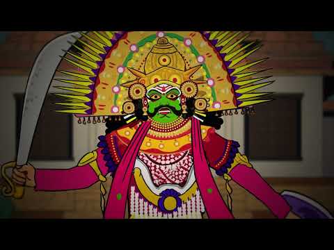
The execution is where this strategy truly comes to life. The ad uses a classic Setup-Turn-Payoff structure. The Setup is a simple, relatable live-action scene where a visitor asks, “What’s so special about Odisha?” This question frames the entire narrative and establishes the 'outsider' perspective that the ad will proceed to educate. The Turn is the ad's most brilliant moment: a handshake that dissolves the mundane world into a vibrant, animated dreamscape rendered in the local Pattachitra art style. This transition is the hook, signaling that the answer to the question won't be told, but shown. For nearly two minutes, the viewer is immersed in a musical montage celebrating everything from Odissi dance to local food, all animated with loving detail. The choice of Pattachitra is a masterstroke; it's not a generic animation but a visual language native to the region, lending the tribute immense authenticity. The Payoff brings it all back to the product. The swirling cultural icons don't just disappear; they coalesce and literally form the packaging of the Royale Glitz paint can. The message is elegantly delivered: this product contains the spirit of Odisha. The final return to live-action, with the visitor's newfound understanding, provides a satisfying narrative closure.
The debrief for the marketing team is clear: deep cultural resonance can be a more powerful differentiator than any product feature. While a two-minute animated film is a risky media spend in the age of skippable ads, its value lies in its potential for earned media and building genuine community affinity. This ad demonstrates that when a market leader acts with cultural respect and artistic integrity, it can reinforce its leadership in a way that challengers find almost impossible to counter. The product becomes more than paint; it becomes a statement of identity.
Theme Keywords
Brand Position
The brand that celebrates and curates India's diverse cultural beauty, enabling you to express your heritage in your home.
Brand Archetype
Creator
Creative Game Plan
Transform a can of paint into a canvas for Odisha's rich cultural story, using the region's own Pattachitra art style to earn genuine credibility and emotional connection.
Diagnosis: Issues & Solutions
Primary Issue: Strategic Sense
The Problem:
The ad's 2:11 runtime is a significant barrier to entry for a digital audience with short attention spans. While the content is beautiful, a large portion of the paid audience will likely skip before the brand and product payoff, limiting the campaign's reach and commercial efficiency.
The Solution:
Develop a suite of shorter, 15- and 30-second edits. Each short-form ad could focus on a single aspect of the animated journey (e.g., the food, the dance, the temples) to create intriguing, bite-sized stories that drive curiosity towards the full film while ensuring the brand message is delivered quickly.
Secondary Issue: Clarity of "What's Next?"
The Problem:
The campaign creates significant emotional investment and product desire but fails to channel it. Viewers are left wondering where they can buy this special edition pack and for how long it will be available, creating a frustrating gap between inspiration and action.
The Solution:
Incorporate a simple, clear call to action on the end slate. A line such as "Available at your nearest dealer through December" or a QR code that links to a store locator would bridge the gap and convert brand love into potential sales.
Additional Notes
Related Links
Credits
Share this Analysis
More Asian Paints ad breakdowns
- Asian Paints Tractor Emulsion – Tukka nahi Tractor - 20 sec GujaratiAsian Paints
- Asian Paints Terrace Waterproofing – Damp Proof - HindiAsian Paints
- Juice or shakes, no stress! Apcolite All Protek with Lotus Effect keeps walls stain-free | HindiAsian Paints
- Asian Paints SmartCare TVC - Waterproofing Solutions with Warranty (40 Seconds)Asian Paints
- Asian Paints Tractor Emulsion – Tukka nahi Tractor - 3+30 sec MarathiAsian Paints
- Asian Paints Apcolite All Protek - Daag Ko Daag Banne Hee Na De | 35 seconds - HindiAsian Paints
- Asian Paints Tractor Sparc - Budget Mein Fit, Shauk Ki No Limit.Asian Paints
- Asian Paints Tractor Sparc Emulsion – Budget Wala Paint (30 sec)Asian Paints