Asian Paints Ke Saath Painting Se Pehle Colour Visualisation - Aapne Socha Bhi Nahi Hoga - Ad Analysis

AI Editor notes
Straight from the gut!!
“This is solid, workhorse advertising. It's not going to win a Cannes Lion, but it doesn't need to. It takes a genuine customer headache and solves it cleanly with technology. The 'future-telling' gag is a bit cheesy, but it gets the point across in seconds. Smartly, it focuses on the utility that greases the wheels for the final sale, rather than on abstract lifestyle imagery.”
Quick Summary
This ad effectively sells a solution, not just a can of paint. It removes the single biggest point of friction in the customer journey—color uncertainty—by demonstrating a simple, almost magical tool that makes the decision process tangible, fun, and risk-free, pulling customers directly into the brand's ecosystem.
Executive Summary
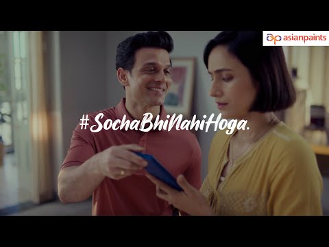
Asian Paints' 'Colour Visualiser' ad is a masterclass in utility-driven marketing. Instead of selling a dream, it sells a solution. The entire creative is built around a single, powerful consumer insight: choosing a paint color is fraught with anxiety because of the inability to accurately predict the final outcome. This fear leads to decision paralysis, a major barrier in the sales cycle. Asian Paints doesn't try to overcome this with emotional lifestyle vignettes; instead, it addresses the problem head-on with a tangible tool.
The execution follows a classic Problem-Solution framework, perfectly suited for its 35-second runtime. The setup establishes the relatable conflict—a couple debating a color choice, with the wife voicing the core anxiety: "How will this wall look after painting?" This immediately grounds the ad in a real-world dilemma. The 'turn' is the husband's playful reveal of the app, reframing technology as a form of future-sight. This leads directly into the product demo, the heart of the ad. By showing the app's interface seamlessly changing the wall colors in real-time, the ad proves its value proposition without ambiguity. The payoff is the final scene: the couple, happy and relaxed in their perfectly painted room, their initial anxiety replaced by satisfaction. The tagline, "Aapne socha bhi nahi hoga" (You wouldn't have even thought of it), effectively frames this utility as an unexpected innovation.
The debrief for any brand team watching this is clear: when you have a tool that removes a significant point of friction in the customer journey, lead with it. This ad doesn't just build brand preference through vague association; it creates brand insistence through practical value. It successfully shifts the consumer's task from the daunting 'choosing' of a color to the fun 'trying' of colors, effectively lowering the barrier to entry and making Asian Paints an indispensable partner in the home renovation process.
Theme Keywords
Brand Position
The innovative and helpful partner that makes home transformation easy and risk-free.
Brand Archetype
Magician
Creative Game Plan
Demonstrate how our app magically removes the fear and uncertainty of choosing a paint color by letting you see the future on your walls.
Diagnosis: Issues & Solutions
Primary Issue: Emotional Connection
The Problem:
The ad is so focused on the functional benefit of the tool that it misses an opportunity to connect on a deeper level. The 'happy couple in a new room' is a category trope that feels staged and generic.
The Solution:
Instead of a generic couple, anchor the story in a more specific life moment. For example, a young couple preparing a room for their first child, using the app to find the perfect, calming color. This adds emotional stakes and makes the final satisfaction feel more earned and memorable.
Secondary Issue: Strategic Sense
The Problem:
The ad does not fully communicate the integrated nature of the Asian Paints service. It shows the 'what' (visualize color) but misses the 'what next' (how to buy, find a painter, etc.), leaving the app feeling slightly disconnected from the complete painting journey.
The Solution:
Add a simple line or icon in the final CTA screen that hints at the next step, such as "Visualize, then find a certified painter in one tap." This would position the app not just as a visualizer, but as the central hub for the entire home painting project, strengthening the brand's ecosystem.
Additional Notes
Credits
Share this Analysis
More Asian Paints ad breakdowns
- Asian Paints Tractor Emulsion – Tukka nahi Tractor - 20 sec GujaratiAsian Paints
- Asian Paints Terrace Waterproofing – Damp Proof - HindiAsian Paints
- Juice or shakes, no stress! Apcolite All Protek with Lotus Effect keeps walls stain-free | HindiAsian Paints
- Asian Paints SmartCare TVC - Waterproofing Solutions with Warranty (40 Seconds)Asian Paints
- Asian Paints Tractor Emulsion – Tukka nahi Tractor - 3+30 sec MarathiAsian Paints
- Asian Paints Apcolite All Protek - Daag Ko Daag Banne Hee Na De | 35 seconds - HindiAsian Paints
- Asian Paints Tractor Sparc - Budget Mein Fit, Shauk Ki No Limit.Asian Paints
- Asian Paints Tractor Sparc Emulsion – Budget Wala Paint (30 sec)Asian Paints