Asian Paints: Ghar Ka Sabse Khoobsurat Decoration Hai Usmein Basi Khushiyan, Ranking Story - Ad Analysis

AI Editor notes
Straight from the gut!!
“It’s a classic, solid piece of brand work. It’s not trying to be flashy or win awards for edgy creativity. Instead, it plays right in Asian Paints' wheelhouse: simple, warm, human stories. You could swap the logo with a dozen other brands and it might still work, but Asian Paints has earned the right to tell this story. It’s competent, safe, and does the job of making you feel good about the brand.”
Quick Summary
This ad reinforces Asian Paints' market leadership by shifting the conversation from the product (paint) to the benefit (a happy home). It argues that while their paint makes walls beautiful, it's the people and their relationships that truly bring a home to life, cleverly positioning the brand as a silent, essential backdrop to cherished family moments.
Executive Summary
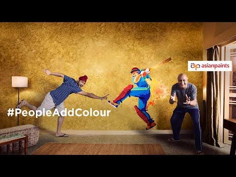
This Asian Paints spot, part of the '#PeopleAddColour' campaign, is a textbook example of how a market leader reinforces its dominance not by shouting about product features, but by owning an emotional territory. The ad operates on a simple, deeply relatable human truth: a house is just a structure, but a home is created by the people and relationships within it. Asian Paints has spent decades building the 'Har Ghar Kuch Kehta Hai' (Every Home Tells a Story) platform, and this ad is a confident, quiet continuation of that narrative. It's not trying to persuade you to pick up a paintbrush tomorrow; it's embedding the brand into the very concept of 'home' in the consumer's mind.
The execution follows a simple Setup-Turn-Payoff structure. The Setup is the conversation around the dinner table where the landlords playfully critique their past tenants, establishing a lighthearted premise. The Turn occurs when they give their current tenant a comically low rank of 'ten' for snoring, creating a moment of mock tension. The Payoff isn't just the shared laughter that resolves the tension, but the visual of them having a pillow fight, which physically demonstrates the voiceover's point: 'The most beautiful decoration in a home is the happiness that resides within it.' The product—paint—is visible in the beautifully colored walls and the final mural, but it's relegated to the role of the stage, not the star of the show. This is a deliberate and smart choice. By making the people the 'colour,' Asian Paints positions itself as the enabler of these happy moments, not the source of them.
The debrief for the team that made this would be straightforward: mission accomplished. The ad successfully lands a brand-level message in an efficient 30-second format. It avoids the category trap of showing pristine, empty rooms and instead fills them with life, quirks, and affection. This is what separates a category leader from challengers; they don't sell paint, they sell the feeling of home. The work is not groundbreaking, but it doesn't need to be. Its strength lies in its consistency and its confident reaffirmation of the brand’s core emotional promise.
Theme Keywords
Brand Position
The silent partner in creating the cherished memories that make a house a home.
Brand Archetype
The Caregiver
Creative Game Plan
Demonstrate that the true vibrancy and 'colour' of a home are derived from the people, their interactions, and the happiness they share.
Diagnosis: Issues & Solutions
Primary Issue: Emotional Connection
The Problem:
The story is warm and charming, but it lacks a significant emotional peak. The stakes are low, and the resolution, while sweet, is fleeting. It generates a smile but might not be powerful enough to create a lasting emotional imprint compared to more poignant stories.
The Solution:
To elevate the emotional impact, the setup could have hinted at a deeper loneliness for the couple, making the young man's presence and the shared laughter feel less like a simple joke and more like a genuinely vital moment of connection that fills a void.
Secondary Issue: Strategic Sense
The Problem:
The ad is so focused on the brand's ethos that it almost becomes generic. While it feels like an Asian Paints ad because of their history, the core idea could be adopted by a real estate company, a furniture brand, or even a food delivery service. Its ownability relies heavily on the viewer's prior knowledge of the brand's platform.
The Solution:
Subtly integrate the act of painting or choosing a colour into the narrative itself. For example, the 'ranking' could have been tied to which tenant helped pick a colour or whose personality matched a certain shade, making the link to the product category more intrinsic to the story.
Additional Notes
Related Links
Credits
Share this Analysis
More Asian Paints ad breakdowns
- Asian Paints Tractor Emulsion – Tukka nahi Tractor - 20 sec GujaratiAsian Paints
- Asian Paints Terrace Waterproofing – Damp Proof - HindiAsian Paints
- Juice or shakes, no stress! Apcolite All Protek with Lotus Effect keeps walls stain-free | HindiAsian Paints
- Asian Paints SmartCare TVC - Waterproofing Solutions with Warranty (40 Seconds)Asian Paints
- Asian Paints Tractor Emulsion – Tukka nahi Tractor - 3+30 sec MarathiAsian Paints
- Asian Paints Apcolite All Protek - Daag Ko Daag Banne Hee Na De | 35 seconds - HindiAsian Paints
- Asian Paints Tractor Sparc - Budget Mein Fit, Shauk Ki No Limit.Asian Paints
- Asian Paints Tractor Sparc Emulsion – Budget Wala Paint (30 sec)Asian Paints