Aqualogica Glow+ Dewy Sunscreen I Feels so Light, Shields so Right - Ad Analysis

AI Editor notes
Straight from the gut!!
“Making the sun a literal bad guy is a bit on the nose, but I see the play. It's a simple, visual way to frame a conflict for a social media feed. The 'Bro, it's Aqualogica' line feels a little focus-grouped, but it gets the casual tone across. The core idea is solid enough to cut through some of the noise in the crowded Indian D2C skincare market.”
Quick Summary
Aqualogica personifies the sun into a theatrical, easily defeated villain, framing its sunscreen not just as a product but as the perfect, lightweight hero for a Gen Z audience that wants protection without the hassle of thick, greasy formulas. [4, 6, 7]
Executive Summary
This Aqualogica ad is a solid piece of challenger brand marketing that understands its audience and objective perfectly. Its strength lies in its simplicity, using a classic Problem-Solution narrative wrapped in a modern, social-media-friendly execution.
The Core Insight here is that for many consumers, especially younger ones, the biggest barrier to using sunscreen isn't the sun itself, but the sunscreen. Traditional formulas are often seen as thick, sticky, and a chore to apply. [7] The ad taps into the desire for protection that doesn't feel like a compromise on comfort. The brand understands that the true enemy isn't just UV rays, but the unpleasant sensory experience of conventional sun care.
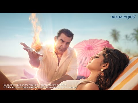
The Execution follows a simple Setup-Turn-Payoff structure. The Setup establishes the problem by personifying the sun as 'Mr. Sun'—a theatrical, arrogant villain who revels in his power to intimidate beachgoers. This immediately creates a clear antagonist and raises the stakes in a humorous way. The Turn occurs when Mr. Sun confronts the protagonist. He expects fear but is met with nonchalant confidence. This is the pivot point where the power dynamic shifts from the problem (the sun) to the solution (the user, armed with the product). The Payoff is twofold: the protagonist calmly explains why she's confident—the product is lightweight yet powerful (SPF 50+, PA++++)—and Mr. Sun is vanquished, exploding into a puff of smoke. This visual metaphor directly links the product to defeating the 'problem.' The final tagline, "Feels so light, shields so right," neatly summarizes the core value proposition that was just demonstrated.
The Debrief for the team is that simple, well-defined creative devices work. Personifying a problem is an old advertising trick, but it remains effective because it makes an abstract threat (UV damage) tangible and relatable. For a challenger brand like Aqualogica, which is part of the Honasa Consumer portfolio, creating a distinct personality is crucial in a crowded market. [1, 2] This ad successfully gives the brand a confident, modern, and slightly witty personality that resonates with its Gen Z target. The lesson is to not overcomplicate the message when your product's benefit is straightforward. Define the enemy, present your product as the hero, and do it with a tone that your audience will actually enjoy watching.
Theme Keywords
Brand Position
The effortlessly effective sunscreen for modern Indians.
Brand Archetype
The Hero
Creative Game Plan
Defeat the hassle of traditional sunscreen by personifying the sun as an old-school villain who is no match for our modern, lightweight formula.
Diagnosis: Issues & Solutions
Primary Issue: Strategic Sense
The Problem:
The ad's central conflict is memorable but also one-dimensional. By making 'Mr. Sun' a pure villain, it misses the nuance that people actually enjoy the sun and don't want to 'defeat' it, but rather enjoy it safely. The creative is built entirely on avoidance rather than enabling a positive experience.
The Solution:
Reframe the conflict slightly. Instead of Mr. Sun being a villain to be vanquished, he could be an overbearing friend or a powerful force to be negotiated with. The protagonist's confidence would then come from being able to coexist with him on her own terms, which is a more sophisticated and positive emotional territory.
Secondary Issue: Clarity of "What's Next?"
The Problem:
The ad ends with a generic pack shot and logos of e-commerce partners. This is standard but passive. For a digital-first brand targeting a digitally-native audience, the CTA could be more engaging and direct.
The Solution:
Incorporate a more interactive or urgent CTA. This could be a QR code on screen for a limited-time offer, a call to join a '#SunChallenge' on social media, or a direct link in the video description to a specific landing page with a 'first purchase' discount.