Apna Ghar, Toh Apna hi Hota Hai | 36 Years of Khudke Ghar Ka Sukh | LIC HFL - Ad Analysis

AI Editor notes
Straight from the gut!!
“This is safe, classic, heart-warming stuff. It’s what you expect from a legacy brand like LIC. They're not trying to be edgy; they're reminding you they're the reliable, bedrock choice. The vignettes are relatable, but a bit generic. The final shot of putting the nameplate on the door is the strongest moment. It's solid, if not terribly exciting work.”
Quick Summary
This ad effectively reinforces LIC HFL's position as a foundational partner in the Indian dream of homeownership by focusing entirely on the emotional payoff—the small, personal freedoms and joys that a 'ghar' provides—rather than the transactional details of a loan. It's a pure brand-building exercise that connects the company's 36-year legacy to the timeless, universal aspiration of having a place to call your own.
Executive Summary
LIC Housing Finance’s 36th-anniversary film, “Apna Ghar, Toh Apna hi Hota Hai,” is a classic example of brand-building rooted in a fundamental human truth. It forgoes product-speak and interest rates in favor of pure emotional resonance, positioning the brand not as a lender, but as an enabler of life's most cherished moments. The strategy is to connect LIC HFL’s three-and-a-half-decade legacy directly to the deeply ingrained Indian cultural aspiration of owning a home.
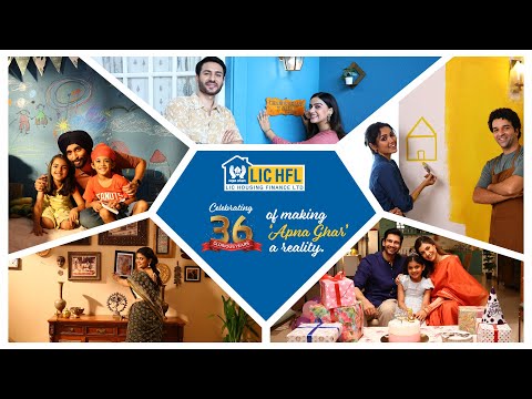
The core insight is simple yet powerful: a house is a rental space, but a home is a canvas for your life. The film’s execution uses a Lifestyle/Aspirational montage to bring this to life. It follows a clear narrative structure based on a series of proofs. The setup isn't a problem, but a premise: 'What does it mean to have your own home?' The film then provides the answer through a sequence of vignettes, each a 'proof point' of the freedom and joy of ownership. We see a family throwing a birthday party without needing 'permission,' children expressing their creativity by drawing on walls without fear of consequence, memories being displayed freely as photos, and walls being painted in colors of personal choice. These small acts of personalization are the payoff. They are freedoms that renters often don't have, making the distinction between a house and a home tangible. The final, and most potent, proof is a woman replacing a generic nameplate with a personalized one—the ultimate symbol of belonging and identity.
The film concludes by explicitly linking these emotional benefits back to the brand. The voiceover states that for 36 years, LIC HFL has been providing this 'sukh' (happiness/satisfaction). This debrief moment solidifies the brand's role as the silent, steadfast partner behind these stories. The key takeaway for the team is that in a category often mired in financial complexity, reinforcing the emotional 'why' can be more powerful than explaining the 'how.' The ad effectively builds brand preference by making the audience feel the end result, creating a positive halo effect that can influence decisions when the time for a loan finally comes.
Theme Keywords
Brand Position
The trusted, long-standing partner that enables the emotional fulfillment of the Indian dream of homeownership.
Brand Archetype
The Caregiver: The brand is portrayed as nurturing, supportive, and enabling, helping people achieve a fundamental sense of security and happiness.
Creative Game Plan
Connect LIC HFL's 36-year legacy to the small, personal freedoms that transform a house into a home.
Diagnosis: Issues & Solutions
Primary Issue: Brand Distinctiveness
The Problem:
The ad's central theme—the emotional joys of owning a home—is a well-worn trope in the housing finance category. While executed with warmth and competence, the series of vignettes feel familiar and could have been produced by any major competitor, slightly weakening the ad's ability to stand out in a crowded market.
The Solution:
Incorporate a more unique, ownable brand element. Perhaps weave in the iconic LIC 'two hands protecting a flame' logo subtly into the scenes (e.g., as a child's drawing, a shadow on the wall) to visually tie the moments of protection and happiness back to the parent brand's core identity, making the creative less generic.
Secondary Issue: Clarity of "What's Next?"
The Problem:
The film does a great job of building emotion but leaves the viewer with nowhere to channel it. There is no clear call-to-action, not even a website URL. While part of a larger digital campaign, the film as a standalone asset misses the opportunity to guide interested prospects to the next step, such as the 'Digital Name Plate Generator' mentioned in press releases. [6]
The Solution:
Add a simple, non-intrusive on-screen text or QR code in the final frames that directs viewers to the 'Apna Ghar, Apna Naam' microsite. This would bridge the gap between the emotional brand film and the interactive digital activation, converting passive viewers into active participants.