Air Astana - Safety video (English version) - Ad Analysis

AI Editor notes
Straight from the gut!!
“Finally, a safety video I wouldn't mind watching. It’s a smart way to solve the core problem: nobody pays attention to these things. Using silhouettes is clever—it’s visually distinct and avoids the uncanny valley of some live-action videos. It feels premium and calm, which is exactly the vibe you want from an airline. The real question is, does the artistry overshadow the instructions? For me, it walks the line well.”
Quick Summary
Air Astana transforms a mandatory, often-ignored safety briefing into a captivating piece of brand art. By using minimalist silhouette animation, the airline communicates critical information clearly while simultaneously positioning itself as a sophisticated, elegant, and creative brand, ensuring passengers actually watch the safety demonstration.
Executive Summary
In the world of airline marketing, few assets are as challenging and overlooked as the pre-flight safety video. It’s a mandatory, repetitive, and functionally-driven piece of communication that passengers are conditioned to ignore. Air Astana and its agency, FCB Almaty, tackled this challenge not by adding celebrity cameos or flashy humor, but by stripping the concept down to its artistic essence. This 2017 safety video is a masterclass in turning a business necessity into a brand-defining moment through the power of elegant, minimalist design.
The Core Insight here is simple but potent: people will pay attention to vital information if it’s presented beautifully. The standard approach of a smiling flight attendant demonstrating a seatbelt has lost its impact through sheer repetition. Air Astana recognized that to cut through this apathy, the medium had to be the message. The insight is that elegance and clarity are not mutually exclusive; in fact, artistry can be the most effective vehicle for instruction.
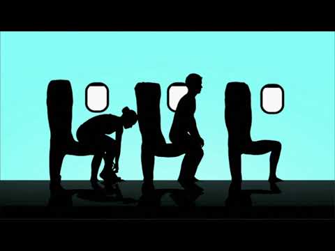
The Execution is built around a single, powerful creative device: silhouette animation. The entire video unfolds like a piece of shadow theatre. This Documentary/Educational format is elevated into a Lifestyle/Aspirational piece through its visual style. We can analyze its effectiveness using the AIDA (Attention, Interest, Desire, Action) model, repurposed for a safety context.
- Attention: The video grabs attention within the first three seconds. The typical cabin interior is replaced by a stark, colorful background and fluidly moving silhouettes. The visual of human bodies forming the letters 'AIR ASTANA' (0:10) is immediately engaging and signals that this is not a standard safety briefing.
- Interest: Interest is sustained by the clever and continuous transformation of the silhouettes. They don’t just perform actions; they become the objects themselves. Figures morph into airplane seats (1:26), they hold up giant seatbelt buckles (0:24), and their bodies spell out the word 'EXIT' (1:34). This constant visual creativity keeps the viewer engaged, wondering what they'll see next, all while the calm voiceover delivers the critical information.
- Desire: In a commercial context, 'Desire' is for the product. Here, it’s the desire to feel safe and to fly with a brand that is this thoughtful, calm, and sophisticated. The smooth animations and soothing music create a feeling of reassurance and competence. The desire is to trust the airline that produced this video.
- Action: The intended action is for passengers to absorb the safety instructions and, more broadly, to form a positive impression of the Air Astana brand. The video ends with a shot of the real flight crew, seamlessly connecting the abstract art back to the real people responsible for passenger safety (2:50).
The Debrief for the creative team is overwhelmingly positive. They successfully transformed one of the most mundane pieces of corporate communication into a memorable brand asset. They proved that you don't need a massive budget or A-list celebrities to be effective; a strong, simple creative idea executed with precision is far more powerful. The video is ownable, distinct, and serves its primary purpose while adding significant brand value. It's a reminder that every touchpoint with a customer is an opportunity to build the brand.
Theme Keywords
Brand Position
The airline that combines pristine safety with effortless elegance.
Brand Archetype
The Sage/Creator
Creative Game Plan
Turn a mandatory safety briefing into a piece of art to make it unignorable and reflect our brand's elegance.
Diagnosis: Issues & Solutions
Primary Issue: Emotional Connection
The Problem:
The video's greatest strength—its stylized, impersonal animation—is also a potential weakness. By using anonymous silhouettes, it forgoes the opportunity to create a direct human connection with the crew, which can be a powerful tool for building trust and reassurance in a safety context.
The Solution:
Integrate brief, stylized live-action shots of the actual crew performing the key actions. For example, when demonstrating the oxygen mask, transition from the silhouette to a quick, matched shot of a real flight attendant's smiling face putting on the mask before returning to the animation. This would add a human touch without disrupting the elegant aesthetic.
Secondary Issue: Clarity of "What's Next?"
The Problem:
While the safety instructions are clear, the video's function as a marketing piece is only realized passively. There's no explicit bridge between the beautiful safety video and the broader Air Astana brand promise or destination.
The Solution:
At the very end, after the crew shot, add a super: "Safety is our art. Kazakhstan is our canvas. Enjoy your flight with Air Astana." This would explicitly link the creative execution to the brand's identity and its role as the national carrier of Kazakhstan, reinforcing the marketing value.
Additional Notes
Credits
Share this Analysis
More Air Astana ad breakdowns
- Coolest Vacation Flights | Travel to Hills & Mountains with IndiGo | IndiGo 6EIndiGo
- There's an air about India | The sound of a new IndiaAir India
- British Airways | Your Family in the SkiesBritish Airways
- Because tiny things matter | LXmas For You | SWISSSWISS
- Air India A350 | The New Air India ExperienceAir India
- Mother Daughter Duo | Cabin Crew | Happy Mother's Day| IndiGo 6EIndiGo
- Cute Airport Moments | IndiGo 6EIndiGo
- 6E Shuffle | IndiGo x Spotify | Travel + Music | IndiGo 6EIndiGo