(2/3) Careem | كريم .. أقوى من حر الصيف - Ad Analysis

AI Editor notes
Straight from the gut!!
“It's a charming little film. The misdirection with the breaking glass sound is a nice touch. Is it going to win a Grand Prix? Probably not. But for its market—Iraq—it feels authentic and smart. It connects the brand to a real, visceral pain point: debilitating heat. I'm left wondering what parts 1 and 3 of this series are, because as a standalone, it works well.”
Quick Summary
This ad cleverly uses a relatable, humorous family prank to position Careem not just as a ride from A to B, but as an essential escape from the oppressive summer heat. By reframing the service as a 'life hack' for comfort, it builds brand affinity in a way that's culturally specific and memorable.
Executive Summary
Careem's "Stronger Than the Summer Heat" is a solid piece of tactical advertising that demonstrates a keen understanding of its target market. It forgoes grand statements for a simple, relatable human truth: the summer heat in the Middle East is so oppressive, people will invent any excuse to find relief. The ad's strength lies in its simplicity and its execution of a classic Problem-Solution narrative.
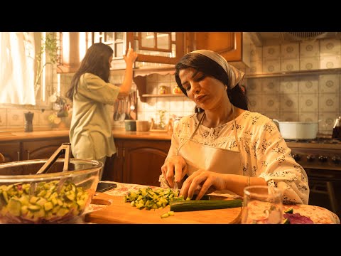
The Setup is established instantly and without dialogue. We open in a hazy, warm-toned kitchen where a mother listlessly prepares food. The visuals and lethargic pacing scream 'heat exhaustion.' This is the problem, a shared experience for millions in the region during summer months. The agency, Noise in Head, correctly identifies that this feeling is a more powerful enemy than any competitor's brand message. The core insight is that Careem isn't just selling a ride; it's selling air-conditioned relief.
The Turn is the creative centerpiece of the ad. The daughter's prank—using a phone sound effect of shattering glass to distract her mother—is a clever and humorous pivot. It serves two functions: it injects comedy and memorability into the spot, and it acts as the catalyst for the solution. Her immediate next action is to open the Careem app. This positions the service as a quick, almost impulsive, solution to the problem. The transition from the tense music of the kitchen to the upbeat soul track in the car is a strong audio cue that signifies the shift from misery to joy.
The Payoff is the final scene inside the cool, comfortable Careem. The mother, now relaxed and happy, is enjoying the very salad that was a source of misery moments before. The ad visually proves its promise. The daughter handing her the salt shaker is the punchline that ties the whole story together. The tagline, "Careem.. أقوى من حر الصيف" (Careem.. Stronger than the summer heat), reinforces the central idea. [12] The campaign successfully frames the comfort of an air-conditioned car as the key product benefit. [12]
The Debrief for the creative team is that deep local insights trump generic global messaging. By focusing on a universal regional pain point, Careem creates a connection that a larger, less nimble competitor might miss. The ad demonstrates that you don't need a large budget or complex plot to be effective; a sharp insight executed with charm and humor can be incredibly powerful. It successfully builds brand equity by positioning Careem as a clever, empathetic solution ingrained in the fabric of everyday life in Iraq.
Theme Keywords
Brand Position
The clever, locally-aware super-app that simplifies and improves everyday life in the Middle East.
Brand Archetype
The Jester
Creative Game Plan
Dramatize the misery of summer heat to position a cool Careem ride as the ultimate, clever escape.
Diagnosis: Issues & Solutions
Primary Issue: Strategic Sense
The Problem:
The ad is explicitly labeled "(2/3)" in its title, but is presented as a standalone piece. This creates a small but noticeable narrative gap, leaving the viewer to wonder about the context of the other two ads and potentially diluting the impact of the overarching campaign idea if they aren't seen together.
The Solution:
For digital distribution, either link the videos together using YouTube's end-screen or playlist features, or add a subtle graphic at the end that teases the other scenarios (e.g., "Stronger than traffic?" "Stronger than errands?"). This would stitch the individual spots into a more cohesive and powerful campaign platform.
Secondary Issue: Emotional Connection
The Problem:
The moment of relief when the mother enters the air-conditioned car is effective but brief. The ad quickly moves to the punchline, missing a slight opportunity to amplify the core emotional payoff.
The Solution:
Add a one-second shot focusing solely on the mother's face as she first feels the cool air, capturing an exaggerated sigh of relief *before* revealing her eating the salad. This would heighten the sensory satisfaction and make the problem-solution contrast even more potent.