1990: Lakme - Ad Analysis

AI Editor notes
Straight from the gut!!
“This is a total '90s time capsule. That synth-pop music and the soft-focus glamour shots are unmistakable. It’s all about creating a vibe—sophistication, elegance, a touch of Western aspiration. It's not telling a story; it's selling a mood. Does it work? For its time, absolutely. Today it would feel slow and a bit generic, but back then, this was peak chic for the Indian market.”
Quick Summary
This 1990 ad cemented Lakmé's status as a modern, aspirational brand by launching its 'Designer Collection' not just as a new range of nail colors, but as an essential fashion accessory for the sophisticated Indian woman. It successfully used a purely visual, 'product-as-hero' approach, focusing on color, style, and an idealized lifestyle to create desire.
Executive Summary
This 1990 commercial for the Lakmé 'Designer Collection' is a masterclass in product-launch advertising for its era, effectively positioning a simple cosmetic as a symbol of modern sophistication. The ad sidesteps complex narratives in favor of a direct, visually-driven 'Product Demo' approach that was both potent and aspirational for the emerging modern Indian consumer.
The core insight driving this ad is that for the target audience, nail color was evolving from a simple cosmetic into a deliberate style choice—an accessory that signals one's personality and worldliness. The ad taps into this by framing the product not just as polish, but as a 'collection' curated for a discerning, 'designer' sensibility.
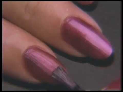
The execution follows a classic Hook-Showcase-Payoff structure. The Hook is immediate and audacious: a deep male voiceover declares, "Nail enamel will never be the same." This bold claim, paired with slick visuals of the product, creates instant intrigue. The Showcase forms the body of the ad, a montage of flawlessly applied nail polish in a 'stunning range' of colors. Crucially, it contextualizes the product within a sophisticated lifestyle through vignettes of perfectly manicured hands playing the piano, dialing a phone, or moving a chess piece. These are visual shorthand for elegance, intelligence, and modernity. The product is the undisputed hero, with repeated close-ups on the bottle and the glossy finish. The Payoff comes with the final branding shots and the tagline, "The difference is sensational," which ties the feeling of sophistication directly to the product. The closing image of the elegant model seals the aspirational message.
The debrief for any team looking at this work today is a lesson in focus. When your objective is to launch a product with a clear visual benefit (i.e., new colors), a direct and polished demonstration can be incredibly powerful. The ad successfully built desire by creating a mood of attainable glamour. While it might lack the emotional depth or narrative complexity of contemporary advertising, its single-minded dedication to making the product look desirable is a solid strategic choice that was highly effective for its time and place.
Theme Keywords
Brand Position
Lakmé is the premier, sophisticated, and accessible beauty brand for the modern Indian woman.
Brand Archetype
The Ruler. The brand projects control, confidence, quality, and leadership in its category. Its personality is: Elegant, Modern, and Confident.
Creative Game Plan
Establish the new 'Designer Collection' as the ultimate accessory for the modern, sophisticated woman by showcasing its extensive color palette in a glamorous, aspirational lifestyle montage.
Diagnosis: Issues & Solutions
Primary Issue: Emotional Connection
The Problem:
The ad's greatest strength—its cool, aspirational elegance—is also a weakness. It's emotionally distant, presenting a flawless but untouchable ideal. The viewer admires the image but doesn't feel a personal, warm connection to the brand.
The Solution:
A modern interpretation could introduce a micro-moment of humanity. For example, after the perfect chess move, show a hint of a confident, knowing smile from the woman. This would add a layer of personality and warmth without compromising the overall sophisticated tone.
Secondary Issue: Strategic Sense
The Problem:
The use of generic symbols of sophistication (piano, chess) feels slightly dated and relies on a narrow, Westernized definition of a modern woman. It shows what she does, but not who she is.
The Solution:
To make it more distinctive, ground the elegance in a more specific or authentic context. Instead of a piano, perhaps it's a hand confidently signing a business document or artfully arranging flowers, activities that could feel more relatable and less like a stock photo of 'class'.
Additional Notes
Related Links
Credits
Share this Analysis
More Lakmé ad breakdowns
- New Lakmé Peach Milk Moisturiser and Soft Crème (TVC)Lakmé
- Lakmé Absolute Matte Revolution Lipstick | #FreeYourLipsLakmé
- Lakmé Absolute Perfect RadianceLakmé
- Lakmé Absolute Perfect Radiance Facial Kit - HindiLakmé
- This festive season we have got #RedsForAll! Have you found yours?Lakmé
- Lakmé 9 to 5 Lip & Cheek ColorLakmé
- Lakmé 9to5 Primer + Matte Lipstick - EnglishLakmé
- Lakmé Absolute Matte Ultimate Lip ColorLakmé