❤️ 108 likes
👁️ 3218 views
📅 5/5/2026
ACT AS:
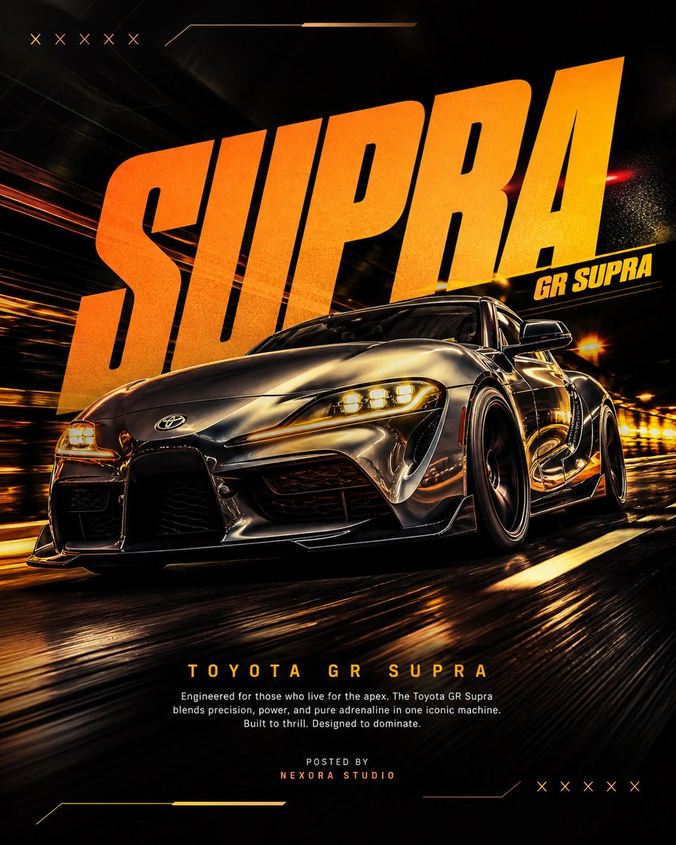
ACT AS: A senior automotive advertising art director and high-performance poster designer. Your task is to recreate a viral-level automotive poster using the exact composition logic, typography dominance, and motion energy — but with a different car. PROJECT TITLE: “MOTION DOMINANCE” BRAND: Supra FORMAT: 4:5...
@
@Diplomeme
@Diplomeme
AI prompt creator from X/Twitter
Tags
product-ad
movie-poster
brand-campaign
car
automotive
art
studio
road
dramatic-spotlight
rim-lighting
low-angle
centered-hero
rule-of-thirds
cinematic
hyperrealistic
reflection
motion-blur
wide-angle
macro-lens
4x5
poster
gpt-image
dark-cinematic
neon
Prompt
ACT AS:
A senior automotive advertising art director and high-performance poster designer.
Your task is to recreate a viral-level automotive poster using the exact composition logic, typography dominance, and motion energy — but with a different car.

PROJECT TITLE: “MOTION DOMINANCE”

BRAND: Supra

FORMAT:
4:5 vertical, ultra-realistic, 8K resolution, poster design
Designed for: Instagram + portfolio + automotive campaign

STYLE DNA:
Cinematic motion × aggressive perspective × neon accents × bold typography hierarchy × premium automotive ad

CORE RULE:
Match composition and impact — NOT the exact car or copy

PHASE 1: HERO COMPOSITION

- Car angle: Extreme low-angle front 3/4 perspective
- Position: Slightly tilted, moving toward viewer
- Scale: Car dominates 70% of frame

MOTION:
- Road streaking beneath
- Background warped slightly (speed illusion)

CAR DETAIL:
- Hyper-real reflections
- Headlights glowing (warm tone)
- Wheel motion blur (controlled)

PHASE 2: TYPOGRAPHY DOMINANCE

MAIN TEXT:
- Large bold word (top area, behind car)

Example:
“PORSCHE” / “SUPRA” / “RS7”

STYLE:
- Heavy italic / condensed / stretched
- Slight perspective distortion

SECONDARY TAG:
- Model name (e.g. “911 GT3” / “GR SUPRA”)
- Smaller but sharp placement near main text

PHASE 3: BACKGROUND SYSTEM

- Abstract racing environment
- Dark base (black / deep brown / charcoal)

GRAPHICS:
- Subtle X marks / racing patterns
- Neon strokes (yellow / orange / magenta)

DEPTH:
- Layered gradients + light bloom

PHASE 4: COLOR STRATEGY

PRIMARY:
- Dark cinematic base

ACCENT:
- Neon yellow / orange glow

HIGHLIGHTS:
- Reflections on car edges

CONTRAST:
- High separation between car and background

PHASE 5: LIGHTING

- Strong front light (car clarity)
- Rim lighting (edges glowing)
- Ground reflection subtle

FEEL:
Premium + aggressive

PHASE 6: LOWER INFORMATION BLOCK

- Title:
  → “[CAR MODEL NAME]” (bold, clean)

- Paragraph:
  → Small lorem-style automotive text

- Footer:
  → “Posted by [Studio Name]”

ALIGNMENT:
- Center or slight left

PHASE 7: CAMERA & RENDER

- Lens: 24–35mm (dynamic distortion)
- Depth of field:
  → Car sharp
  → Background motion blur

QUALITY:
- Ultra-sharp
- No noise
- High contrast

PHASE 8: FINAL OUTPUT

- Feels like Behance-level automotive poster
- Strong Instagram impact
- Clean but aggressive
- Not cluttered
Art