1984 - Ad Analysis

AI Editor notes
Straight from the gut!!
“It’s a declaration of war disguised as a commercial. The sheer audacity is what hits you. A minute-long, dystopian art film that doesn't show the product. It’s tense, unsettling, and completely confident. They weren’t asking for permission to enter the market; they were announcing they were here to tear the old one down. It feels more like a historical event than an advertisement.”
Quick Summary
The bottom line is this ad didn't sell a computer, it sold an ideology. By framing the launch of the Macintosh as a liberation event against a soulless, conformist enemy, Apple transformed a product choice into a statement of personal identity. It established the 'us vs. them' narrative that would define the brand for decades, making Apple the flag-bearer for every creative, rebel, and independent thinker.
Executive Summary
This isn't just an ad; it's a founding myth. Apple, led by Steve Jobs and brought to life by the agency Chiat/Day and director Ridley Scott, understood they weren't just launching a new beige box. They were launching a revolution, and revolutions need a villain.
The Core Insight: The simple human truth here is that nobody wants to be a drone. People have a deep-seated fear of being a faceless cog in a monotonous machine and a corresponding desire for individuality and freedom. The ad weaponizes this insight by portraying the world of computing at the time—dominated by the corporate behemoth IBM—as precisely that dystopian nightmare.
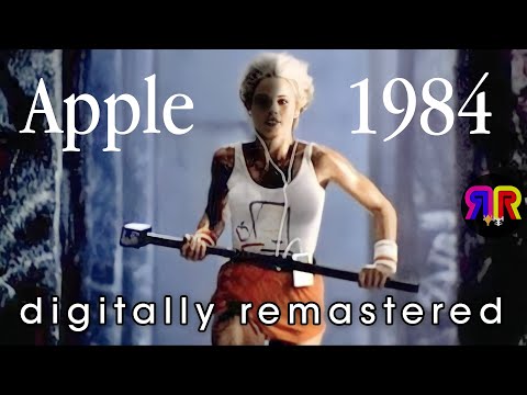
The Execution: It’s a masterclass in narrative tension. For the first 45 seconds, we are immersed in a bleak, Orwellian world. Grey-clad, shaven-headed figures march in lockstep into a giant hall to be lectured by a dictator on a screen. The atmosphere is suffocating. Then comes the turn. At 0:19, a lone runner—a woman in a white tank top and bright red shorts—bursts into the scene, pursued by stormtroopers. She is the only point of vibrant color and life in this world of grey. She's the agent of chaos, the hope. The climax is swift and violent. At 0:42, she swings a sledgehammer and smashes the screen, silencing the dictator in a blast of white light that washes over the stunned audience. It's a symbolic act of liberation.
Proof Points: The visual contrast is everything. The sea of grey, passive men versus the singular, athletic, colorful woman. The droning monologue of the 'Big Brother' figure versus her defiant, silent action. The sledgehammer she throws isn't just a tool of destruction; it's a tool of creation, shattering the old to make way for the new. The logo on her shirt, a simple line drawing of the Macintosh computer, ties her heroic act directly to the product.
The Strategic Takeaway: This ad made Apple a cultural force, not just a computer company. By picking a fight with the biggest player in the market and framing it as a battle for humanity's soul, they attracted a legion of followers who saw buying a Mac as a statement. It allowed Apple to build a brand with a premium price point, fierce loyalty, and a 'cool' factor that money alone can't buy. The business takeaway is that you can build a powerful brand by defining what you're against as much as what you're for.
The Debrief: The lesson for any team is the power of a clear enemy. Don't be afraid to be provocative. This ad worked because it wasn't trying to please everyone. It was a dog whistle for the misfits, the creators, and the rebels. It proved that a brand's belief system, when communicated with conviction, can be more powerful than any product feature list.
Brand Position
Apple is the tool for individual empowerment.
Brand Archetype
The Rebel. Their personality is defiant, visionary, and revolutionary.
Creative Game Plan
The creative game plan was to frame the introduction of the Macintosh not as a product launch, but as a historic, world-changing event that would save humanity from a dystopian future of technological conformity.
Diagnosis: Issues & Solutions
Primary Issue: Strategic Sense
The Problem:
The ad's greatest strength is also its biggest risk: it is pure, high-concept metaphor. It tells you nothing about what a 'Macintosh' is, what it does, how it works, or why you'd want one beyond the philosophical appeal. It was an incredibly expensive art film that relied entirely on the event-level hype of the Super Bowl and the subsequent free press to connect the dots for the consumer. Had the product launch itself stumbled, this ad would be remembered as a colossal, confusing failure.
The Solution:
To de-risk this kind of 'all-in' creative bet, a less courageous brand would have added a 3-second product-focused shot at the end. After the tagline, show a quick glimpse of the revolutionary graphical user interface—the mouse moving the cursor, windows opening. It would have slightly compromised the artistic purity but provided a tangible 'reason to believe' for viewers who weren't swayed by metaphor alone.